In my last post, I talked about the power of a typeface and the impact it can have on your audience.
Today, I will discuss the role and proper usage of fonts in web design.
Let’s start with the basics. Fonts can be divided into two categories: serif and sans serif. To put it simply, serif fonts have little tails at each character’s points, while sans serif fonts do not have these extra marks (“sans” is the French word for “without”).
Here, you can see a serif font (Georgia) next to a sans serif font (Verdana):

Believe it or not, there has been much research and debate on the two type categories, but the general consensus seems to indicate:
- When viewing the document on-screen, sans serif fonts are easier to read (especially in small sizes) due to the effects of anti-aliasing.
- When viewing the document in print, serif fonts are better.
- Serif fonts are preferred in large formats (print and online) or when emphasizing text because it visually breaks apart each character.
- Serif fonts tend to “look” more serious
While I wholeheartedly agree with all three points, there’s a fourth I’d like to add, a point from my perspective:
So what does this mean?
If you want your content to have a serious, business-like tone, set it in a serif font…but make sure the type is large enough to read easily.
Many designers would scoff at this advice, as we are taught never to use serif fonts for the main copy of a website. However, in my personal opinion, serif fonts can have a great impact when used correctly.
Now, let’s move on to the use of fonts in web design.
I have a love-hate relationship with fonts when designing a web page because there are so many fonts I would love to use (and I would have a glorious time choosing each one!)…but I’m restricted by the rules garnering web-safe fonts. This means that if the user does not have that particular font installed on their computer, they will only see the text in the default font set by the web browser.
You can see the (sadly) short list of web-safe fonts here.
There are three primary ways to work around this problem.
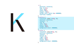
The first: convert your text into images. See the “Geek in Heels” at the top of this page? The font I used is an obscure type that most viewers would not have on their computers…so I’ve converted it into an image.
The downside to this method is obvious: while this can be useful when creating headers, menus and such, it just isn’t practical for large copies of text. Or with site with dynamic content. Or content that is frequently updated, such as a blog.
The second method is to embed the typeface within the document via PDF or Flash. With either formats, the typeface is loaded with the document so the visual rendering of the font is not lost. However, this method can also be impractical for the same reasons as the first.
The third method isn’t so much of a solution as it is a workaround via the use of font family stacks in CSS.
Here is an example of font stacking in CSS:
font-family: StoneInformal, Palatino Linotype, Book Antiqua, Palatino, serif;
This gives the browser an order in which the fonts should be displayed. In other words, the browser will first check to see if the user’s computer has StoneInformal installed. If not, it will then go onto Palatino Linotype, then Book Antiqua, etc.
By stacking the fonts with similar-looking fonts that are more common, you can at least guarantee that what the user sees bears some resemblance to what you intended.
That’s it for my tutorial on fonts and how to use them in web design. I tried my best to KISS (keep it simple, stupid) but I’m sure I got a bit carried away as this is a topic I find fascinating. Please let me know if you have any questions or comments!