Apr 23, 2008  •  In Thursday Geek-isms

Hump Day Hook-Ups

I’m currently sitting at Athens Airport waiting for my flight to Mykonos so I have some extra time. You didn’t think I’d neglect a weekly feature just because I’m on my honeymoon, did you? 😉

  1. Flashback: What the World Was Like When the First iPod Was Released, Wired Gadget Lab. I have a 5-year old 3rd generation iPod that still hasn’t crapped out on me. In fact, the only thing wrong with it is that the battery dies after about 15 minutes…but I still use it in the car where it is constantly plugged into the power source. I still can’t believe the iPod is only 7 years old!
  2. Live Mesh: First Look at Microsoft’s New Platform, ReadWriteWeb. Microsoft’s answer to Google Gears…it also sounds a lot like Apple’s iWeb.
  3. Kart around NYC with free Mario cab rides this Thursday, Joystiq. Sigh…so many things I’m missing this week! On the bright side, Mario Kart Wii should be ready for us when we return.
  4. History’s 5 Best Interface Designs, Wired Gadget Lab. I love articles like this!
  5. Global Warming and Bad Harvests Raise Cost of Beer, Gothamist. Why?!? Why must terrible things like this happen?
  6. Delta “Cozy Suites” Make Economy Class Semi-Tolerable, Gizmodo. This actually looks pretty dope. Two more years!
  7. Death Star Wedding Cake Wins Fanboy of the Year Award, Sets Grounds for Divorce, Gizmodo. I really wanted a cool wedding cake, especially after seeing the now-famous Super Mario Wedding Cake. But nooo…we needed to spend the money on flowers instead. You tell me which is better: flowers that die, or a totally geekalicious wedding cake and the fame that comes with it.
  8. Dying ‘Last Lecture’ Prof’s New Book Becomes a Runaway Seller, Wired Science. Randy
    Pausch’s story holds a special place in my heart because he was very involved in the organization where I work…I’ve even done some marketing publicizing this “Last Lecture”! His life truly is inspirational and touching.
  9. Problem Child: Putting the Fun in Dysfunctional, Jezebel. Researchers at Johns Hopkins has found that parents are way more strict with their older children than their younger siblings. (Duh!) But wait, they even have a mathematical formula to prove it! Ahh, my good ol’ alma mater…
  10. WTC Construction Update: Freedom’s Garbage, Curbed. A homeless man, while rifling through garbage, found the blueprints for Freedom tower. Wow I feel so safe!
Apr 22, 2008  •  In Personal, Travel

Honeymoon Day 1: Athens

Greece is amazing! I’ll try not to go into too much detail so please forgive me if start to ramble. (Click on the thumbnails to view the full gallery)

Getting There:

We arrived at the hotel a full 4 hours before check-in, so we had to wait a bit at the hotel bar. However, the room was worth the wait. They upgraded us from a regular room to their trademark Graffiti Room! Each Graffiti Room is painted by a famous artist and has a different theme. The theme of our room was “Sleepy.”

Baby Grand Hotel, Athens:

Unfortunately, we both passed out almost immediately after settling in. After wasting almost the entire day, we got up at around 8pm and managed to explore the area a bit. We ended up in Plaka, which is Athens’ old town and we had dinner there.

First night in Athens:

You may also like:

Apr 20, 2008  •  In Personal, Relationships

We’re Married!

We’re leaving for the airport in an hour, but I’ll continue to keep updating in Greece!

You may also like:

Apr 18, 2008  •  In Personal, Relationships

I am…

I am…

I will be…

I am getting married today.

You may also like:

Apr 15, 2008  •  In Depression, Personal

Unmedicated

Back in college I went through a dark period of constant despair, suicidal thoughts, and even self-mutilation. A good friend urged me to seek treatment, and I reluctantly did.

I was diagnosed with major depression, took a medical leave of absence from school, and was treated with psychotherapy and medications for the next few years.

So when I read today’s NYTimes article “Who Are We? Coming of Age on Antidepressants”, which discusses the lack of information regarding the long-term effects of antidepressants, I naturally thought back to that period of my life.

I’ll be honest with you: those drugs were pretty dope.

I was on both Prozac and Welbutrin, and at one point I was maxed out on both doses. I have never done illegal drugs, but I like to think that this cocktail provided a sense of euphoria that must be similar to some of the weaker street substances.

An added bonus was that both drugs killed my appetite. This, along with the increased energy they provided, led me to shed pounds with no increased effort. I was at my thinnest while taking these drugs.

However, nothing is perfect and there were some cons that came a-knockin’ with these pills.

First, they killed my sex drive. Zero. Zip. Nilch. Nada. Not only did the desire diminish, the land down under would stay as dry as a desert.

Second, I would constantly wake up in the middle of the night. These weren’t peaceful, bleary-eyed wakeups either. Rather, my eyes would snap open and immediately my mind would flood with thoughts that refused to stay silent.

There also were the tremors. My hands would be prone to tremors that made me want to hide them at all times. These tremors were visible, constant reminders of my illness, of my weakness.

In the article the author mentions that many who have taken antidepressants for years become so dependent on them that their lives and core beings become altered. And this is the fourth and final reason I’ve decided to stop my meds: I was afraid to lose my passion.

During one of my many therapy sessions my psychologist recommended that I read a book called Touched with Fire. Written by Kay Redfield Jamison, the book examines the link between manic depression (otherwise known as bipolar disorder) and creativity. Although I wasn’t bipolar, she suggested that I, as an artist, may find solace in knowing that some of history’s most brilliant and creative minds also suffered from bouts of depression.

The book also brought up a point that sticks with me even to this day: many of the geniuses mentioned in the book would refuse to take medication and/or refused treatment for fear that their creativity would be hindered.

The Academy Award-winning movie A Beautiful Mind touches on this topic as well. In the movie, John Nash refuses to take his meds because they interfere with his way of thinking. In short, he is not able to do his work, his passion, while on his medication.

I confess that I haven’t been feeling my best as of late. In the past year or so, I have had episodes of pure despair and uncharacteristic tendencies. I have morbid thoughts and I retreat from friends and the outside world at large. I am scared, because I know these are signs of a possible relapse.

At the same time, I have never felt so alive. The intense downs contrast so beautifully with life in general that I cannot feel but feel inspired. I bang out tunes on the piano, many melodies from the deep corners of my soul. I write stories filled with details and embellishments that surprise even myself. And for the first time in years I want to start painting again.

As a textbook ISFP I have trouble opening myself to others. However, those who are close to me can attest that I am a very passionate person, and although this passion has gotten me in trouble many times over, it is one of the things I treasure the most about my personality.

This is precisely the reason I do not want to go back into therapy, or start taking antidepressants again.

Sure, I was generally happier while on the meds. And I may be doing something very stupid and very dangerous by refusing treatment. But the fact remains that they made me lose my passion. I needed…I need these downs, for without them my life would play in low contrast.

I need the melancholy that saturates life with the most vivid colors.

You may also like:

Apr 9, 2008  •  In Thursday Geek-isms

Hump Day Hook-Ups

I’ve been reading so many interesting things this past week that it was quite difficult to choose just ten…so I decided to be a bad girl and upped it to twelve. Enjoy!

  1. Keep It Simple, Stupid: Why Gadgets Should Have Less Features, Not More, Wired: Gadget Lab. Hear, hear! Exactly what I’ve been advocating for the past decade.
  2. Isiah Thomas’s New York Knicks Are the Worst Team in the History of Professional Sports, New York Magazine. At first I was angered. Then I was sad. Now I’m optimistic. Because at this point, there really isn’t anywhere to go but up.
  3. Texans Build World’s Most Powerful Laser, Wired: Science. Lasers. (Smile) POWERFUL lasers. (Goofy grin) Sharks with frickin’ laser beams attached to their heads! (Evil laughter) Okay, so that last part was unnecessary. But this is still pretty geekalicious news.
  4. Cheap Chinese Electronics May Not Be So Cheap Anymore, Gizmodo. I always said China will take over the world some day. (Why else would I be marrying a Chinese dude?) Can you imagine how powerful China would be if their electronics reach the status of those made in Japan?
  5. And This Is How You Do a Loft, Ikea Hacker. One of the best designed and well-utilized Ikea hacks I’ve seen in a while. Oh Ikea, how I heart thee. God bless the Swedes.
  6. 10 Cool Gadgets You Can’t Get Here, Slashdot. Sometimes I really hate living in the US.
  7. GTA IV ‘better than all the hype suggests’ according to first person to complete the game, Joystiq. I had been intrigued by the newest GTA ever since it was announced and stirred up some good controversy. According to this review, this particular GTA “‘craps on all the others’ in the franchise.”
  8. First Look at Renovated Madison Square Garden, Curbed. I’m not sure how I feel about the renovations since my office is right at Penn Plaza and dodging the construction work and noise will be a major PITA. However, MSG is due for a facelift and hey, maybe a new look is sign for a new (improved) team (Knicks)?
  9. Martha Stewart for 1-800 Flowers, Brooklyn Bride. Although I’m not much of a fan for flowers, I have to admit that these arrangements are gorgeous. Especially the first one. I love you, Martha! You my girl!
  10. Japanese Creative Packaging Design Solutions to Ugly Barcodes, Boing Boing. Once again, ADEB (Asians Do Everything Better).
  11. Miss USA’ Marketers: Watch This Pageant Cuz Pretty Chicks Are Idiots! Jezebel. With pageant ratings taking a dive in the past few years, the forces behind Miss USA have decided to go another way with their marketing efforts. Hilarious!
  12. Dead Woman Buried With Cell Phone Allegedly Sends Texts to Husband, Gizmodo. What a great idea! When I die, please bury me with my cell phone AND laptop. I shall continue to text and blog from the beyond.
Apr 7, 2008  •  In Art/Design, Fonts, Geek

Fonts & Web Design

In my last post, I talked about the power of a typeface and the impact it can have on your audience.

Today, I will discuss the role and proper usage of fonts in web design.

Let’s start with the basics. Fonts can be divided into two categories: serif and sans serif. To put it simply, serif fonts have little tails at each character’s points, while sans serif fonts do not have these extra marks (“sans” is the French word for “without”).

Here, you can see a serif font (Georgia) next to a sans serif font (Verdana):

Believe it or not, there has been much research and debate on the two type categories, but the general consensus seems to indicate:

  1. When viewing the document on-screen, sans serif fonts are easier to read (especially in small sizes) due to the effects of anti-aliasing.
  2. When viewing the document in print, serif fonts are better.
  3. Serif fonts are preferred in large formats (print and online) or when emphasizing text because it visually breaks apart each character.
  4. While I wholeheartedly agree with all three points, there’s a fourth I’d like to add, a point from my perspective:

  5. Serif fonts tend to “look” more serious

So what does this mean?

If you want your content to have a serious, business-like tone, set it in a serif font…but make sure the type is large enough to read easily.

Many designers would scoff at this advice, as we are taught never to use serif fonts for the main copy of a website. However, in my personal opinion, serif fonts can have a great impact when used correctly.

Now, let’s move on to the use of fonts in web design.

I have a love-hate relationship with fonts when designing a web page because there are so many fonts I would love to use (and I would have a glorious time choosing each one!)…but I’m restricted by the rules garnering web-safe fonts. This means that if the user does not have that particular font installed on their computer, they will only see the text in the default font set by the web browser.

You can see the (sadly) short list of web-safe fonts here.

There are three primary ways to work around this problem.

The first: convert your text into images. See the “Geek in Heels” at the top of this page? The font I used is an obscure type that most viewers would not have on their computers…so I’ve converted it into an image.

The downside to this method is obvious: while this can be useful when creating headers, menus and such, it just isn’t practical for large copies of text. Or with site with dynamic content. Or content that is frequently updated, such as a blog.

The second method is to embed the typeface within the document via PDF or Flash. With either formats, the typeface is loaded with the document so the visual rendering of the font is not lost. However, this method can also be impractical for the same reasons as the first.

The third method isn’t so much of a solution as it is a workaround via the use of font family stacks in CSS.

Here is an example of font stacking in CSS:

font-family: StoneInformal, Palatino Linotype, Book Antiqua, Palatino, serif;

This gives the browser an order in which the fonts should be displayed. In other words, the browser will first check to see if the user’s computer has StoneInformal installed. If not, it will then go onto Palatino Linotype, then Book Antiqua, etc.

By stacking the fonts with similar-looking fonts that are more common, you can at least guarantee that what the user sees bears some resemblance to what you intended.

That’s it for my tutorial on fonts and how to use them in web design. I tried my best to KISS (keep it simple, stupid) but I’m sure I got a bit carried away as this is a topic I find fascinating. Please let me know if you have any questions or comments!

You may also like:

Apr 5, 2008  •  In Art/Design, Fonts, Geek, Logos/Branding

The Power of a Typeface

This week’s NYTimes had an interesting OpEd titled To the Letter Born, discussing the impact that branding, especially the typeface Gotham, may have on Barack Obama’s campaign for the presidency.

For this piece, Stephen Heller interviews a branding expert named Brian Collins who explains:

…there’s an oxymoronic quality to Gotham, which is why I think it’s become so popular. It has a blunt, geometric simplicity, which usually makes words feel cold and analytical (like Univers), but it also feels warm. It’s substantial yet friendly. Up-to-date yet familiar. That’s a tough hat trick.

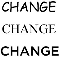
Collins goes on to display the word “Change” in three different typefaces:

Put the word “change” in Comic Sans and the idea feels lightweight and silly. Place it in Times Roman and it feels self-important. In Gotham, it feels just right. Inspiring, not threatening. In the end, typography makes a real difference when it delivers words and ideas that are relevant to people.

This piece naturally intrigued my designer self for two reasons. The first was due to my job: one of my main responsibilities during the first year of my current position was to implement the company’s new, updated logo and carry out the branding and stylistic guidance associated with it. Thus I am quite familiar with the power of branding and the importance of a consistent typeface.

The second reason is because I’m a font freak.

I love the power and impact of typefaces. I love how different fonts evoke certain moods. I relish the visual impact they have on marketing. I am a lover of written words and to me, a typeface that matches the mood of the message brings the final polish and an extra finesse that cannot be conjured by words alone.

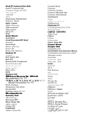
Naturally I have many, many different fonts on my computer and I treasure each and every one of them. I even typed them all out for easy viewing…here is page 1 of 6:

(Yes, you don’t have to tell me…I do have OCD tendencies and this is a prime example.)

Whenever I have a design project on hand I pore over these pages in search for the perfect font. My obsession with fonts has come to a point where I can identify certain typefaces used in advertisements, signs, etc.

However, this obsession does have its drawbacks if you are a web designer. In my next post, I will talk about using fonts for your website: the two main categories of fonts; choosing the best font for your needs; and the limitations on web-based fonts, and the best ways to get around this problem.

You may also like:

Apr 4, 2008  •  In Geek, Shopping

There’s No Place Like 127.0.0.1

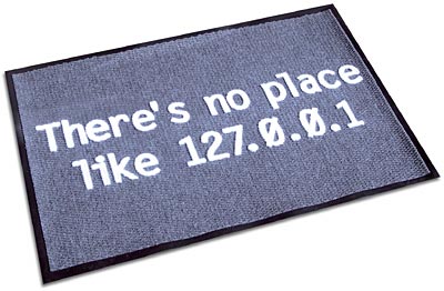
Many years back I discovered a wonderful online store called ThinkGeek.com. I have ordered many items since then but my mind always lingered on the very first item that caught my attention: the There’s No Place Like 127.0.0.1 Doormat.

(If you’re not a geek like me and don’t understand what the mat says, go read http://www.tech-faq.com/127.0.0.1.shtml).

I always vowed that when I get my own place I would prominently display this mat at my front door. (And is it just a coincidence that my birthday numbers are 127? I think not.)

Now, after having closed the condo and all the repairs done, I’ve slowly started to move in. I’m not quite living there yet, but my mind immediately thought back to this doormat.

I ordered it a few days ago and it arrived last night. 🙂

Welcome to geekdom, my friends.

You may also like:

Apr 4, 2008  •  In Geek, Tutorials

Google Reader, Part 2

If you haven’t already done so, please read Google Reader, Part 1.

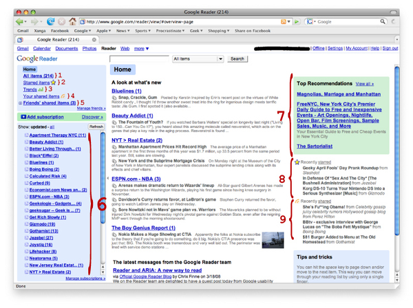
Google Reader is fairly simple to use. Here’s a screenshot of my G-Reader homepage:

An explanation to the numbered features:

  1. All items. This tells you how many unread feeds you have.
  2. Starred items. With G-Reader, you can “Star” certain feeds that may be of particular interest for you so that you can easily locate them in the future.
  3. Trends. This takes you to your Trends Page, which I will discuss later.
  4. Your shared items. G-Reader allows you to “share” items which will then generate a feed of its own (each user gets a unique RSS URL). You can then share this customized RSS feed of your favorite items with your friends.
  5. Friends’ shared items. Just as you can share your items, your friends can share their favorite items too. This is a great way to find out about new blogs…tell me if you use this function and I’ll add you as a friend!
  6. Your subscriptions. Notice that I have the “Show: updated” option turned on at top, so this list only shows the new, unread feeds. You can choose to “Show: all” if you desire, and although I choose note to, you can even organize your feeds using folders!
  7. Top Recommendations. G-Reader will take the sites/blogs you already subscribe to and suggest others that may be of interest to you. Another great way to find new sources of information and inspiration. (You can also access this page by clicking the “Discover” link next to the “Add subscription” option in the left side.)
  8. Recently starred. Lists your three most recently starred items.
  9. Recently shared. Lists your three most recently shared items.

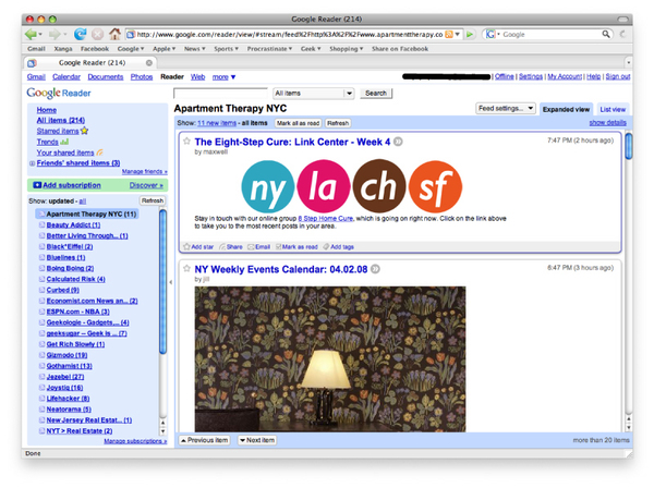
When you click on one of the items in your subscriptions list, the feed will show itself on the right side:

Right now I have G-Reader set to “Expanded View,” which shows the entire feed. You can also choose to have your feeds shown in “List View” by hitting the tab circled below in red:

This is useful for those who just want to skim over the headlines. If you want to read more, you can click on the title and the full feed will expand right below it.

Let’s go back to the Expanded View. You’ll notice that under each item, you have some options:

  • Add star
  • Share
  • Email
  • Mark as read
  • Add tags

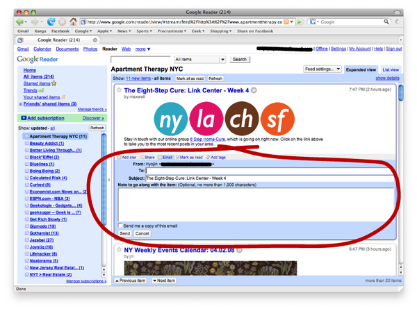
These are all pretty self-explanatory, but Email is a favorite of mine because you G-Reader links to your Gmail account and embeds an email box right into the window:

I love using this function whenever I see a particular item that may be of special interest to a friend…I can email it right over to him/her!

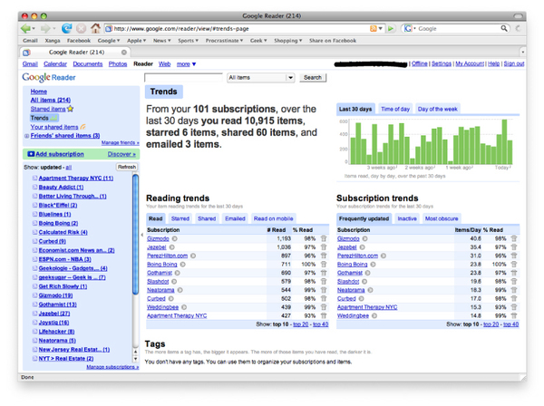
Another useful feature is the “Trends” page:

If you are into data and statistics like me, this page can be fascinating. One particularly useful portion of the Trends page is the “Subscription Trends” section, where you can see a ranking of the most frequently updated subscriptions, inactive feeds (which shows the last time the site was updated), and most obscure (meaning the least amount of subscribers). I used to subscribe to perhaps three times as many blogs and websites, but this “Subscription Trends” section has helped me weed out the outdated subscriptions.

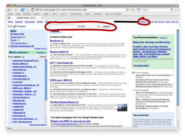
There are two more features I want to discuss: search and offline mode.

The search function, circled on the left, was surprisingly only added a couple of months ago. Before this, whenever I wanted to look for a certain item I remembered reading, I would have to go through my subscriptions one by one. The search function has become a lifesaver for me, especially since you have the option of where you want to search: all, starred, shared, friends’ shared, or a specific subscription.

The offline mode (circled on right) works with Google Gears to let you read your subscriptions while offline. When you select the offline mode, G-Reader starts downloading your feeds to your local drive so that they are accessible whether you have an internet connection or not. This is especially useful if you have a long commute, or about to go somewhere with no reliable internet connection.

The best part? Once you are connected to the web again, you can switch back to the online default mode and your “read” and “unread” items will automatically sync. 🙂

Have I convinced you yet? Even if I haven’t, I hope you at least found it interesting. If you have any questions at all, please feel free to ask!

You may also like: