This week’s NYTimes had an interesting OpEd titled To the Letter Born, discussing the impact that branding, especially the typeface Gotham, may have on Barack Obama’s campaign for the presidency.
For this piece, Stephen Heller interviews a branding expert named Brian Collins who explains:
…there’s an oxymoronic quality to Gotham, which is why I think it’s become so popular. It has a blunt, geometric simplicity, which usually makes words feel cold and analytical (like Univers), but it also feels warm. It’s substantial yet friendly. Up-to-date yet familiar. That’s a tough hat trick.
Collins goes on to display the word “Change” in three different typefaces:
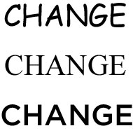
Put the word “change” in Comic Sans and the idea feels lightweight and silly. Place it in Times Roman and it feels self-important. In Gotham, it feels just right. Inspiring, not threatening. In the end, typography makes a real difference when it delivers words and ideas that are relevant to people.
This piece naturally intrigued my designer self for two reasons. The first was due to my job: one of my main responsibilities during the first year of my current position was to implement the company’s new, updated logo and carry out the branding and stylistic guidance associated with it. Thus I am quite familiar with the power of branding and the importance of a consistent typeface.
The second reason is because I’m a font freak.
I love the power and impact of typefaces. I love how different fonts evoke certain moods. I relish the visual impact they have on marketing. I am a lover of written words and to me, a typeface that matches the mood of the message brings the final polish and an extra finesse that cannot be conjured by words alone.
Naturally I have many, many different fonts on my computer and I treasure each and every one of them. I even typed them all out for easy viewing…here is page 1 of 6:
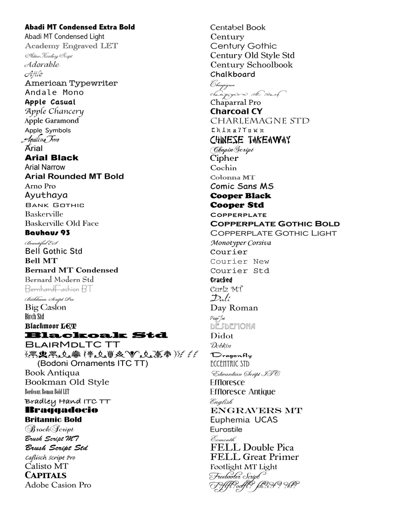
(Yes, you don’t have to tell me…I do have OCD tendencies and this is a prime example.)
Whenever I have a design project on hand I pore over these pages in search for the perfect font. My obsession with fonts has come to a point where I can identify certain typefaces used in advertisements, signs, etc.
However, this obsession does have its drawbacks if you are a web designer. In my next post, I will talk about using fonts for your website: the two main categories of fonts; choosing the best font for your needs; and the limitations on web-based fonts, and the best ways to get around this problem.