There has been a lot of talk lately about redesigning the map of the world’s largest subway system in an effort to make it easier to read and increase ridership.
Designer Eddie Jabbour took up the challenge in a heavy redesign called NYC Subway KickMap:
The Kick Map is designed to get more people to ride New York City’s subway system. Created with clarity and ease of use, it allows riders to navigate this vast system easily and without uncertainty. The subway map is the key to understanding this most complex subway in the world, which has 26 separate lines and 468 stations. A well-designed map not only welcomes and empowers novices to use the subway but also encourages additional use for regular “home-to-work-only” commuters to use the subway for recreational destinations where they might otherwise take a car. For this reason the design of the subway map can directly influence ridership numbers and can indirectly have an effect on New York’s traffic congestion and pollution. In short, a better-designed subway map will make our subway system more open and accessible.
Unfortunately for Jabbour, the MTA rejected the new design. So he took it upon himself to upload the map to the Apple Store so that people can download it to their iPhones…and immediately garnered over a quarter of a million downloads.
Take a look at the map yourself, along with some side-by-side comparisons with the current NYC subway map:
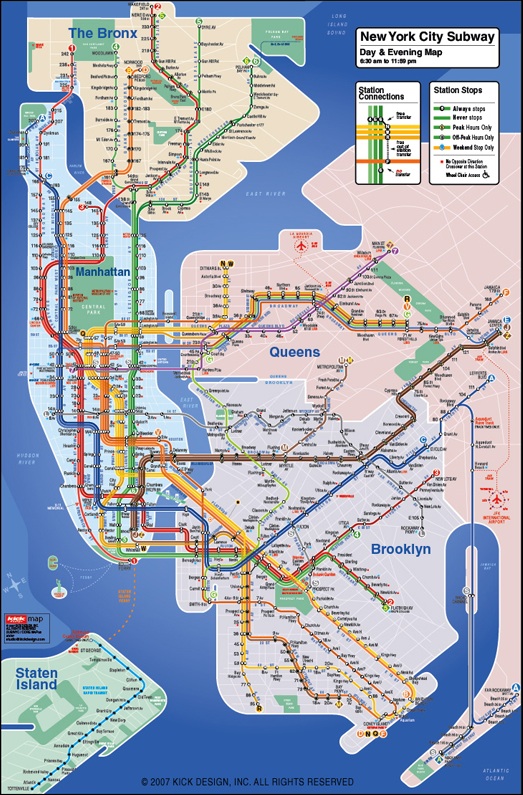
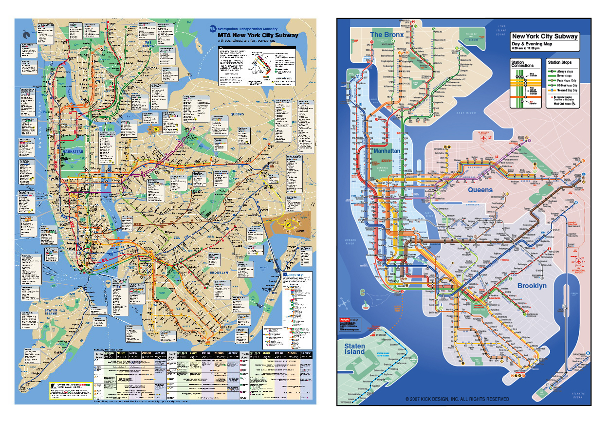
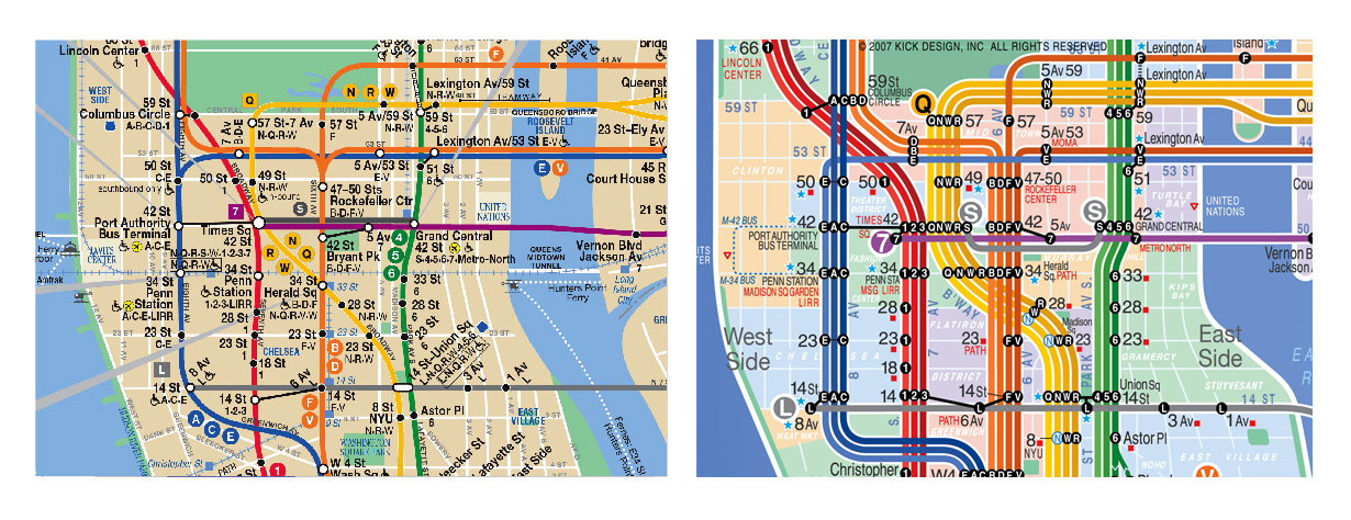
Call me a snobby New Yorker, but I never found the current NYC subway map (and I’m talking about the version whose overall design has been in existence since the late 1970s) to be difficult to comprehend at all. Even my very first time taking the subway alone as a clueless teenager was not marred by confusion over the map.
While I have to admit that Jabbour’s design is definitely cleaner and more aesthetically pleasing, I much prefer the different lines of each color group to be merged as one when they run on the same tracks, as opposed to right next to each other as he has displayed on the KickMap. But that’s just me.
Did you ever have trouble interpreting the NYC subway map? What do you think of the KickMap?
Via Laughing Squid.