Must...
Continue reading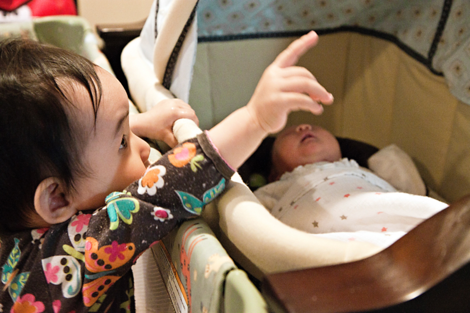
Yesterday, I had noted that Aerin generally seems to be an easier baby than Claire. I now have another theory as to why may be so: it's because as second-time parents, we are much more relaxed about EVERYTHING. For example, for the first few months of Claire's life we religiously tracked her every breath with the Baby ESP app. This time around? We haven't used it, or anything similar to it, once. Earlier this week, Jenn of Orange You Sweet wrote about giving up control as a first-time mother. The post really resonated with me, because with Claire, I had practically driven myself crazy — and even made myself physically ill several times — because I had refused to give up control....
Continue reading
Atypical of Asian parents, mine weren't too strict about grades growing up. In fact, they bribed us — we would get $20 for every A on our report card! (And yes, even A-'s counted.) So whenever I got straight A's, my wallet would be fuller by $120. Not bad at all when you're a kid. What about you? Did your parents offer any enticements for good grades? Via 9GAG....
Continue reading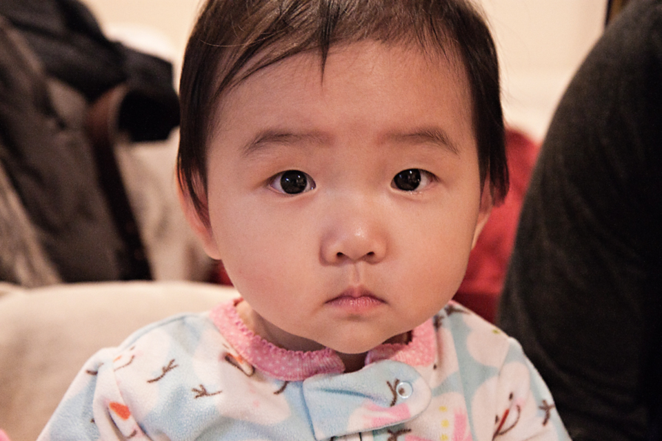
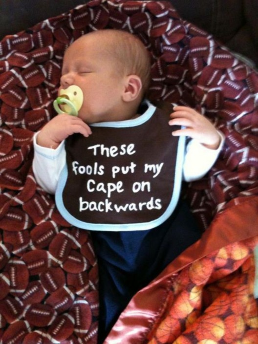
Today, our Aerin Isabel turns one month old. And because I know my sister — who is currently living in Paris(!!!) for 3 months — is always begging me for pictures of her nieces, here is the latest of Aerin: One of the most common questions I hear these days is: how is everything going? In other words, just how in the world am I surviving motherhood with two babies that are just 13 months apart? The answer is simple: one day at a time. That, and wonderful grandparents who are doing everything they can do to pitch in so that I can get some rest here and there. As previously stated, Aerin has finally started to sleep in 2-3 hour stretches. But her day-night reversal has not...
Continue reading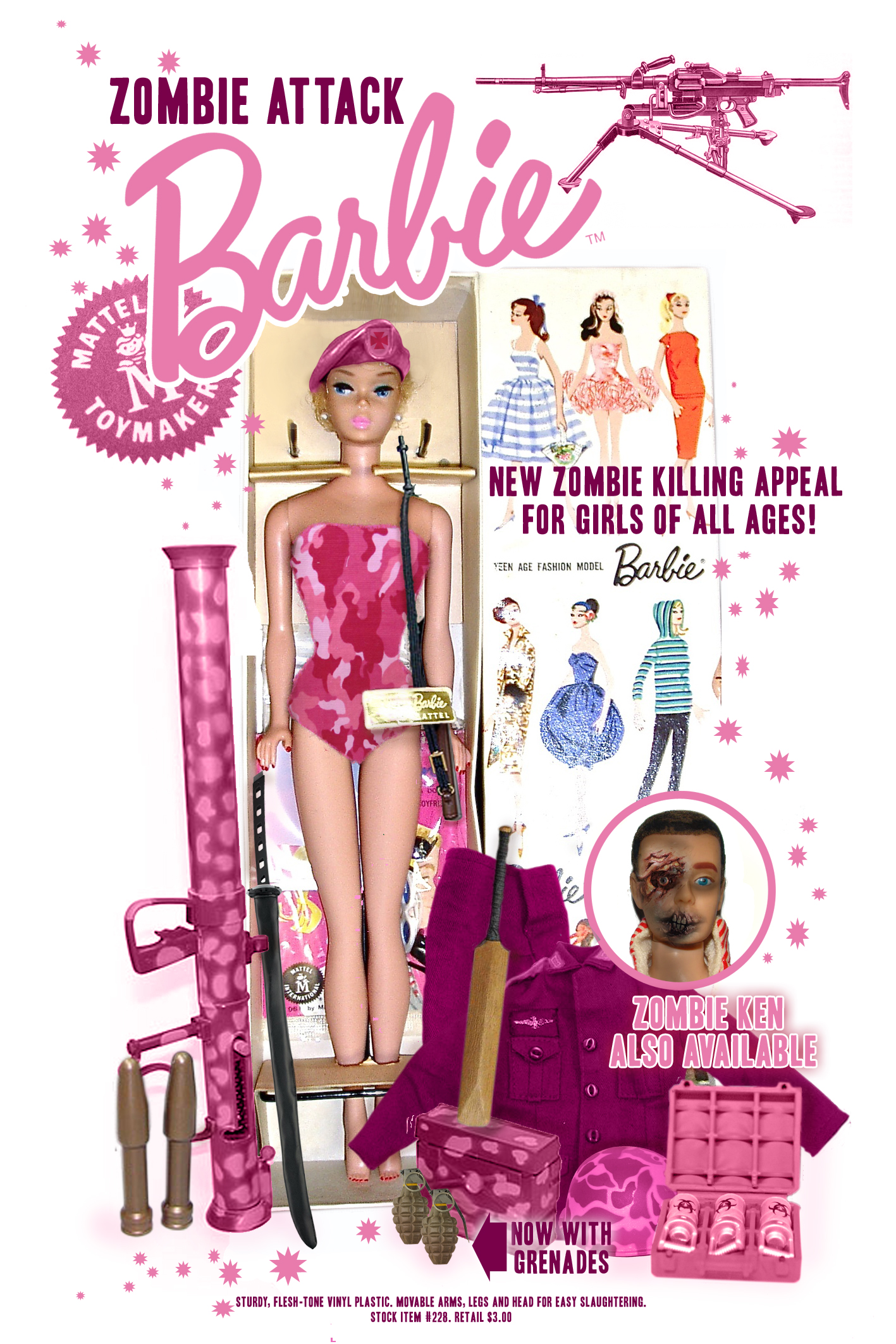
I have never been a doll person, even as a little girl. Would I be opposed to my girls gettings Barbies or other dolls? No, but that doesn't mean that I would prefer them to get something else, like a Transformer. ;-) The Zombie Attack Barbie, on the other hand, is a doll I can get behind...
Continue reading