
Two of the most recognizable logos in N. America have announced drastic facelifts.
First up is Pepsi.
The new Pepsi logo will be skewed in order to resemble a smile:
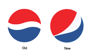
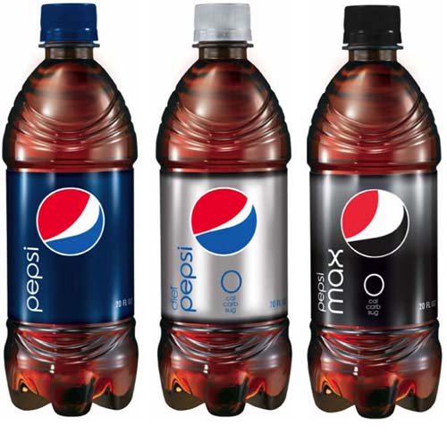
Pepsi, Diet Pepsi, and Pepsi Max will have different variations of the smile. According to AdAge, “a ‘smile’ will characterise brand Pepsi, while a ‘grin’ is used for Diet Pepsi and a ‘laugh’ is used for Pepsi Max.”
Over the next three years, Pepsi plans on spending $1.2 billion to change everything about its brands – their looks, packaging, and merchandising.
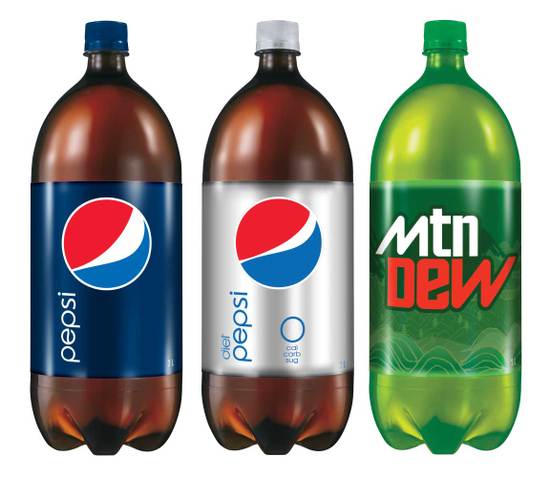
As if that wasn’t enough, Mountain Dew will be rebranded Mtn Dew (perhaps to appeal to the younger, texting crowd?):
My thoughts on Pepsi’s rebranding: I don’t like it.
Last summer, Coca Cola underwent a redesign and came out triumphant. Taking away the superfluous swishes, swirls, and fizzes, it delivered one of the strongest testaments to its brand in the company’s history.
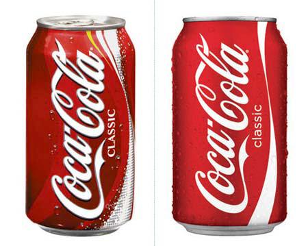
Perhaps Pepsi was trying to take a cue from its biggest competitor. Citing the current economic situation as the driving force behind the rebranding, Pepsi tries to mimic Coca Cola’s design success and miserably fails.
Sure, the new design is more modern, more chic, more hip. However, those words are not always the best choice of adjectives for a 100+ years old company that is synonymous with American culture.
The new bottles look more like space-age energy drinks, if you ask me.
Let’s move on to the next brand on our list: Best Buy.
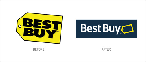
From the before and after shots, it is obvious that Best Buy aimed to draw away from its outdated and garish logo.
I actually like the overall look of the new logo. It’s clean, modern, and plays homage to the old logo.
However, something nagged at me as soon as I laid my eyes on the new logo and I couldn’t figure out why.
Then, while searching for images of the new logo, it hit me.
The typeface.
I had written about the power of a typeface before.
In this case, the typeface does not work with the logo.
It is an indecisive font, neither new nor particularly striking. It is inconsistent in its ends and corners, giving the viewer an unsettled feeling.
Too bad, because the rest of the logo isn’t horrible.
What do you think of Pepsi and Best Buy’s new logos?
(via Brand Infection – Pepsi, Best Buy)

 I like books, gadgets, spicy food, and art. I dislike shopping, hot weather, and the laws of entropy. Although I am a self-proclaimed computer nerd, I still have a love for handbags and makeup... and I am always teetering on high heels. To learn more about me, visit the
According to barryjudge.com (BBY’s CMO blog) the typeface is still under construction.
@Jayysenn – I did not know that! Thanks for the correction!
…please where can I buy a unicorn?
…please where can I buy a unicorn?