
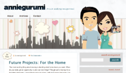
I know many of you read this blog through an RSS reader, but if you have a moment, click on through to see my new layout!

(If you view the site via Internet Explorer, you might miss out on some CSS hover transition effects!)
Some of the new features I have implemented include:
- Front page only displays excerpts for long posts
- “Pin This Post” at the bottom of each post
- Links to the previous and next posts on individual post pages
- …and many more little things here and there
Having had run low on the creative juice, I based this new layout around the Noxon WordPress Theme (in case you’re wondering, yes I purchased it) and made some adjustments to my liking, in addition to considerably cutting down the theme’s file size. The original looks a lot nicer, but this is just a personal blog and I don’t need all the bells and whistles.
I am still working out some browser inconsistencies (IE will be the death of me), but I’m pretty much done and satisfied with the result. 😎
What do you guys think of the new design? Do you like it? Does it look okay on your browser?

 I like books, gadgets, spicy food, and art. I dislike shopping, hot weather, and the laws of entropy. Although I am a self-proclaimed computer nerd, I still have a love for handbags and makeup... and I am always teetering on high heels. To learn more about me, visit the
I love the new look but if you’re at all wavering on the idea, I’d love to have full posts rather than excerpts. Just a personal preference. Otherwise, it’s so clean and pleasant!
The reason I’ve decided to do excerpts for longer posts is to optimize front page loading time, especially since so many of my readers are viewing my blog via their mobile phones (which tend to have slower loading speeds and less powerful CPUs). Not all of the posts will be truncated, but the ones that feature many images will be. Sorry about that!
Ah, I missed the fact that only *some* and image heavy ones at that would be truncated. Makes sense and it’s a good compromise.
I agree with Revanche about the full posts. New look is nice, but I think I’m a little averse to change because I prefer the old layout :p
Sorry about that — like I said to Revanche above, not all posts will be truncated, just the longer ones (especially the ones with lots of images).
Looks great Jenny, very fresh and modern!
loving the new design – looks great in firefox!
Oh! the new design looks interesting!
Although, like some others, I prefer full posts to excerpts… and the fonts in your links on top and your “about” on the right side? (trebuchet or what is it?) It’s not really clear, as in, it’s not a smooth font in my firefox and actually hurts my eyes after a while (i’ve got 100% view, so it’s not that I made it too small)
Hmm which version of FF are you running and on what platform? I’ve tested the site on both Mac and Windows and Firefox looked fine in both.
hmm, I;m running the latest FF, although I’m not sure which one that is. I’m running it on Windows 7… btw, I checked it on the latest IE and it looks a lot smoother than in FF, as if the corners are sharper in FF than in IE
I really like the new layout, it looks clean and simple and professional (even for a personal blog). I love it
I love the fresh, clean look!
I love the new look: it’s really attractive and sleek looking. I think the font is a little small (admittedly I have terrible eyesight). As some other people have mentioned, I also very much dislike excerpts instead of full posts, because if you have a relatively slow connection (which I do because all the telecoms in Singapore are owned by the government) it makes it very difficult to browse through. I suppose it’s better for page views though?
Increased pageviews can be one benefit for truncated posts on the front page, but this doesn’t necessarily mean more ad revenue, as IP addresses are tracked by the companies. The main reason I have decided to show excerpts is to speed up loading time, especially since about 30% of my traffic comes from mobile phone users and their connections and processors tend to be slower. Not all of the posts will be truncated — just the ones that are long (especially the ones with a lot of images).
Very nice new layout! I like that it’s so clean looking. 🙂
Looks great on Firefox! I like the simplicity and clean look.
I’m looking at it in FF and it looks great! Nice job!
I really like this new layout. It’s sleek and organized, however, I miss the animation of the family. Will you be putting the hubs and the babies on the header again?
I tried to incorporate them, but it was hard to do as the last layout featured a bulletin board to which I could stick all sorts of stuff (especially since the drawings of the kiddos were literal doodles) and this design is much more minimalistic. If I find a design that will work, I will definitely include them…but for now, they won’t be there.
I love how clean the layout is, and I really, really like the footer section. Is that Instagram widget part of the theme or is that a plugin?
It’s a WordPress plugin called Instapress: http://wordpress.org/extend/plugins/instapress/
I’ve obviously made some design changes to it via CSS, but the widget itself is highly customizable on its own!
I am liking the new design – it looks great in I. E!!