
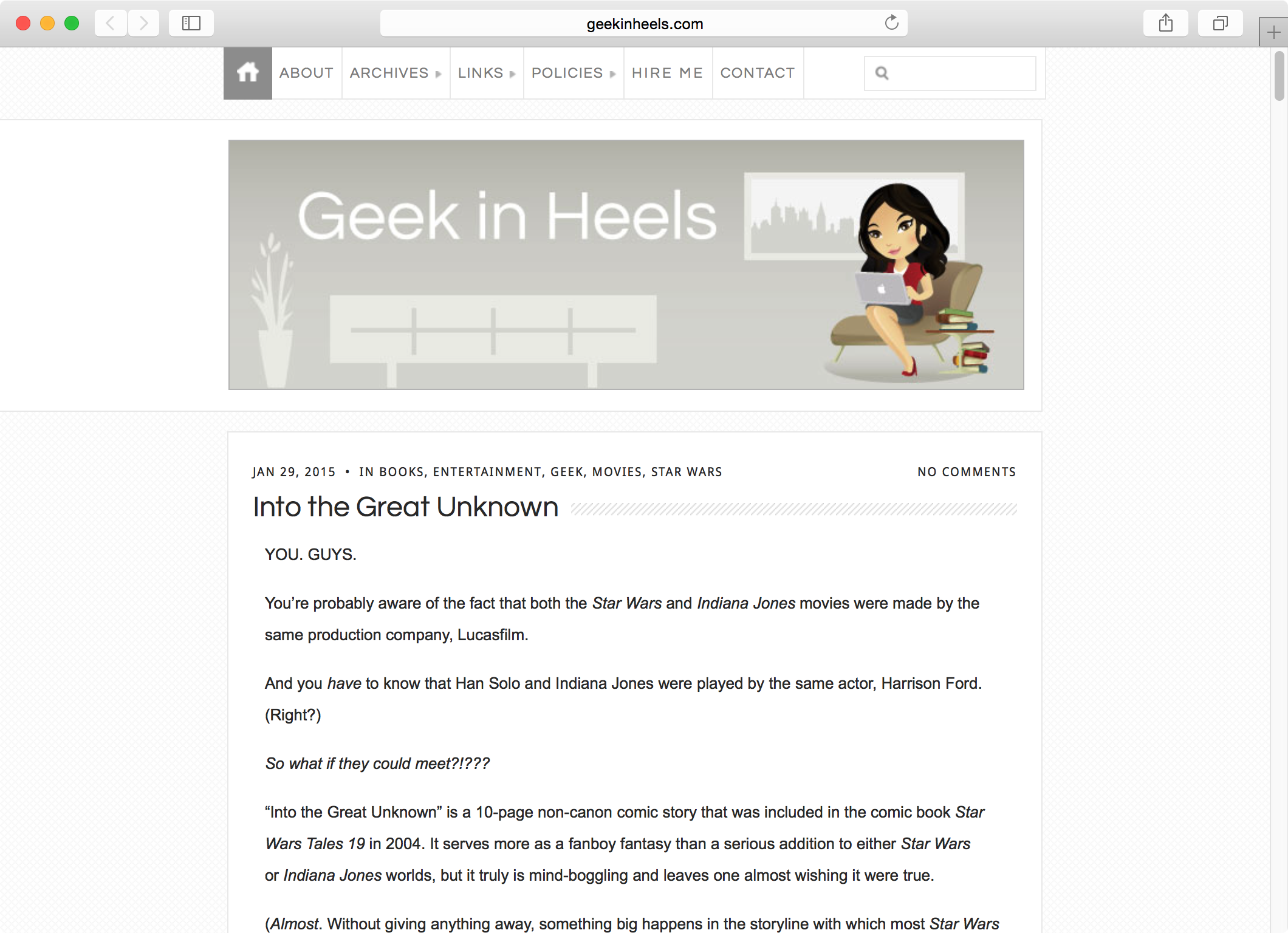
I may be a technology- and gadget-loving geek, but there are some topics that cause me to be bullheaded in my old-fashioned ways. Physical books over e-books/e-readers. Text over videos. (I hate it when I click over to a promising article to discover that I would need to watch a video to see what it’s about. Also, no vlogging or Vine for me.) And websites’ desktop views over mobile views.
Yes, even when browsing the web on my phone, I prefer to view every site as they were originally designed. I appreciate good design. I want to see these designs on my phone, even if it means a longer loading time.
So I put off creating a mobile version of this blog for quite some time, knowing full well that some most people would disagree with me.
But it was a losing battle. Earlier this year, Google announced that it will begin to penalize sites that are not mobile-friendly. And I began to see the ramifications of this decision a couple of months ago, when my traffic began to decrease. More specifically, traffic from search engines….which actually makes up a large chunk of my visitors.
I began work on a responsive design and I did a pretty job of it, but I hated that I couldn’t control every little aspect of it — at least without a lot of extra work — due to the vast varieties of mobile devices and screen sizes out there.
What my site would look like in a responsive format…but it looked crappier
and crappier as the screen decreased in size. It just wasn’t worth it at the end.
So I decided to go with a trusted mobile plugin, WPtouch. It was easy to set up, the customization painless, and…well, take a look! (If you’re not already viewing this on your mobile device, that is.)
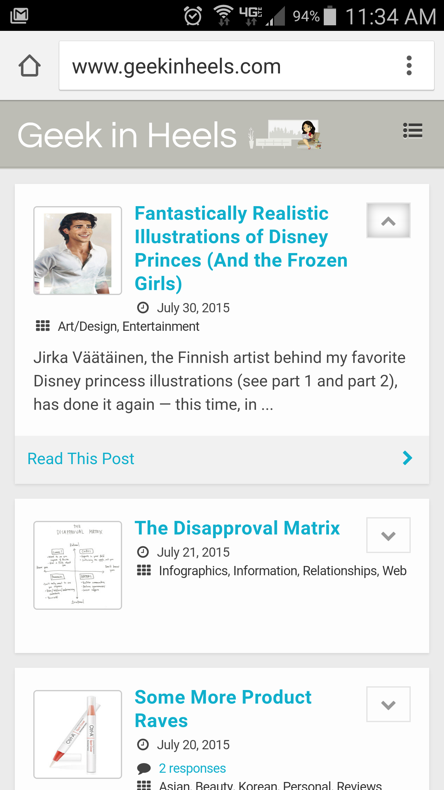
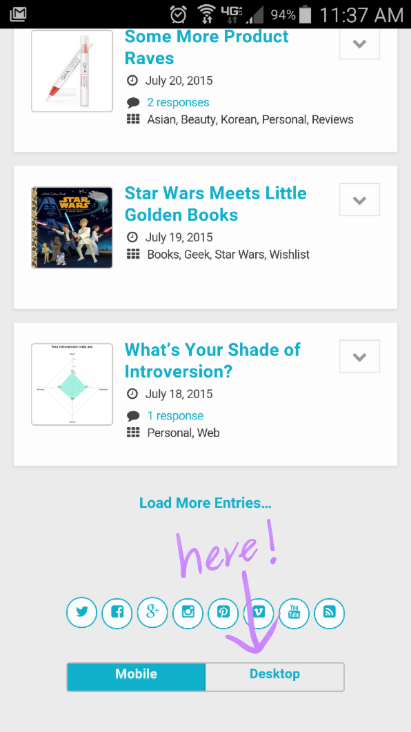
Best of all, there is a toggle at the bottom of the page that allows you to switch to the desktop view if you so desire.
It’s not my ideal solution (because if I had my way, every site would look and behave exactly the same on every device and every browser), but the masses — and Google — have spoken.
What do you think? Go take a look and let me know if you notice any bugs!


 I like books, gadgets, spicy food, and art. I dislike shopping, hot weather, and the laws of entropy. Although I am a self-proclaimed computer nerd, I still have a love for handbags and makeup... and I am always teetering on high heels. To learn more about me, visit the
