
Let’s run through a checklist of things you should’ve done by now:
- installed WordPress in a web or local host
- imported content (whether from another blog or dummy content downloaded from the web) to your new blog
- chosen, downloaded, and installed a blank WP theme
- went through the PHP and CSS files in your blank theme to familiarize yourself with its setup
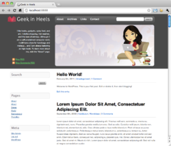
If you have done these things, you should now have a blog that looks similar to this:

Our new blog running the ET-Starter theme with the WP .XML Test Data Import dummy content
Remember when I said in Part 1 of this series that one of the great things about the ET-Starter theme is that you can easily toggle between single, 2, and 3-column layouts? As you can see above the default layout is 3-column with the main content in the middle. We want to change to a two-column with the content on the right.
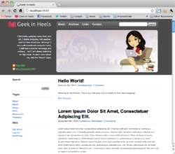
To do this log into your WordPress admin, and click on “Theme Options” under the “Appearance” menu on the left. Check “Yes” next to Would you like a two column theme? and select “content-right” for the Main Content Order option.
Save changes, and your blog should now look like this:

Now, let’s set the dimensions using CSS. Let’s first look at the dimensions of the ET-Starter template. To do this, open the theme’s style.css file and compare it with the theme itself using Firefox’s nifty Firebug extension or using Chrome’s “Inspect Element” feature.
(For this tutorial I will be using Chrome’s “Inspect Element” feature rather than Firebug because I prefer Chrome over Firefox. Chrome’s “Inspect Element” feature is similar to Firebug, but with less options. However, Firebug is an indispensable tool for any web developer/designer and I recommend that you familiarize yourself with it!)
Right-click/control-click on your theme while viewing it in Chrome, and click on “Inspect Element” on the little pop-up menu. A window should slide out from the bottom of the page. While you are in the “Elements” mode (which I believe is the default), run your pointer over the different lines in the lines of code on the left and you should see that the different parts of the window get highlighted while you’re doing this.
By now, you have probably figured out that when you mouseover the different CSS elements, the element on the page that it corresponds to gets highlighted.

You can choose to go more or less detailed into each element and its sub-elements
by clicking on the little arrows at the left of each line.
With this handy feature, we can now see that the content of this blog theme has the CSS class of .content.content-two-columncontent-right while the sidebar has the class of .primary-sidebar.content-two-columncontent-right.
Now take a look at the style.css file. You will see that .content.content-two-columncontent-right has a width of 73% (line 112 on the original file) and that .primary-sidebar.content-two-columncontent-right has a width of 24% (line 178).
We can also see that the “container” ID, which acts like a “wrapper” around the entire the blog, has a width of 940px (line 49).
Now, the way that I want the theme to look is as follows:


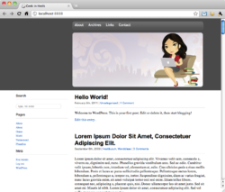
So all we need to do is replace those numbers with the new in style.css:
#container should now have a width of 870px (line 49)
.content.content-two-columncontent-right should now have a width of 600px (line 112)
.primary-sidebar.content-two-columncontent-right should now have a width of 240px (line 178)
Save the file. Your theme should now look like this:

Not much of a change, I know. But we’re slowly but surely getting there!
Next up: the header!
 I like books, gadgets, spicy food, and art. I dislike shopping, hot weather, and the laws of entropy. Although I am a self-proclaimed computer nerd, I still have a love for handbags and makeup... and I am always teetering on high heels. To learn more about me, visit the
