What do you guys think of Yahoo!’s new logo?
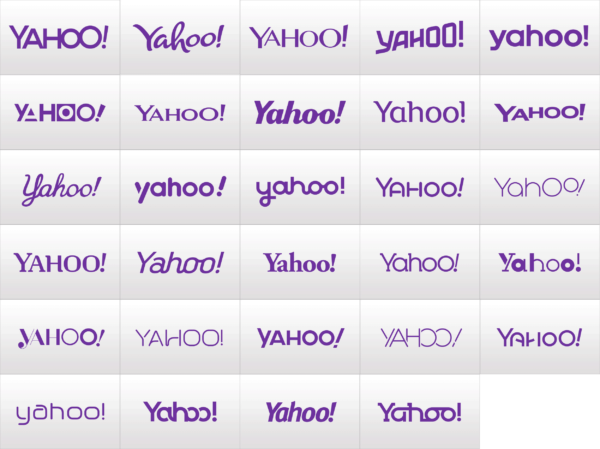
Just in case you weren’t aware, this new logo was revealed after a 30 Days of Change campaign which announced the internet giant’s plans for a new logo and built anticipation by showcasing a different logo every day for — you guessed it — 30 days.
30 Days of Change expectedly received tons of press, and while the buzz died down after the first few days, it definitely got people to talk about Yahoo! again — an achievement in itself according to those who dismiss Yahoo! as a “dying” company.
The campaign also may have been designed as a preemptive warning to the millions of users who visit Yahoo! every day so that the new logo does not come as a complete shock.
But was the buildup — and the expectations that grew along with it — worth it?
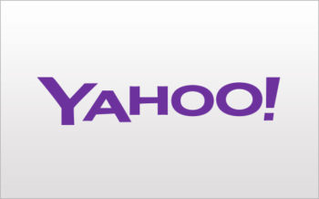
I don’t think so. As stated in the title of this post, the first word that comes to mind when I see the new logo is “Meh.”
Marissa Mayer writes in her blog:
On a personal level, I love brands, logos, color, design, and, most of all, Adobe Illustrator. I think it’s one of the most incredible software packages ever made. I’m not a pro, but I know enough to be dangerous 🙂
So, one weekend this summer, I rolled up my sleeves and dove into the trenches with our logo design team: Bob Stohrer, Marc DeBartolomeis, Russ Khaydarov, and our intern Max Ma. We spent the majority of Saturday and Sunday designing the logo from start to finish, and we had a ton of fun weighing every minute detail.
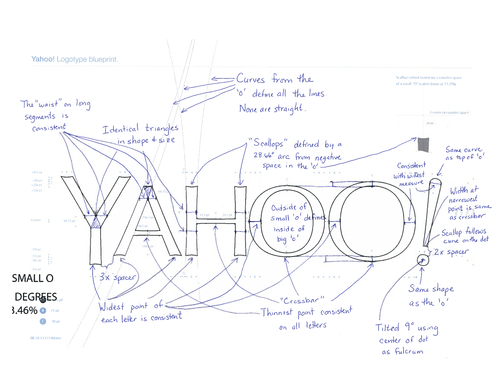
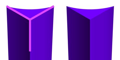
Did you guys notice the chiseling that creates a Y in some of the letters?
I dunno. I’m sure Ms. Mayer and the in-house design team at Yahoo! are plenty talented in their own regard. But I can’t help but wonder if they shouldn’t have hired — oh, I don’t know…a company that actually specializes in logos and rebranding to do the job? The new logo looks weak, unexciting, outdated, and does not look representative of a tech company.
Or even a company that Yahoo! would to want to become. As they say, dress for the job that you want, not the job you have. Unless Yahoo! aims to be an internet portal for those seeking frills and little thrills, this logo leaves much to be desired.
To me, some of the other contenders were much better. My personal favorite is Day 10:
Days 3, 7, and 23 weren’t bad either:
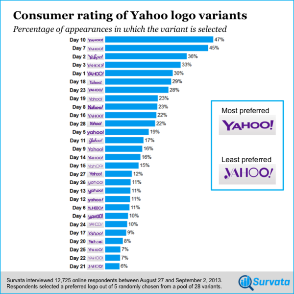
And apparently, my opinion is a popular one. The Survata Blog polled 12,725 people to see which variant they preferred most, and here are the results:
I’d be interested to see the same poll, conducted with the same respondents, with the new official logo included.
ETA, 12:42pm:
Boing Boing posted a link to a site that transforms any text into the style of Yahoo!’s new logo. Give it a go at http://logo.thatsaspicymeatball.com/






 I like books, gadgets, spicy food, and art. I dislike shopping, hot weather, and the laws of entropy. Although I am a self-proclaimed computer nerd, I still have a love for handbags and makeup... and I am always teetering on high heels. To learn more about me, visit the

Out of the variants shown, the Day 14 variant is my personal favorite mostly because I really like the design of that particular round-top ‘A’ which stands out to me.
I also like the apparently popular Day 3 and Day 23 variants a lot as well.
I think the Day 25 variant has tremendous potential, but I have reservations about that suspect-looking ‘A’ and cannot stand that ugly ‘H’. A Day 25 style variant having Day 14’s ‘A’ and ‘H’ lettering would be golden to me.
I was also hoping to see a variant which has all the letters looking exactly the same as they do in Day 14 but slanted in the style of that Day 17 variant.
But the Day 10 winner? Eh… it’s cool, but looks too much like the original style to me. Not that there is anything wrong with being really conservative, though. I just wanted to see more of a deviation from the traditional style in the new look.
I think one of the biggest reasons I like Day 10 the best is because Yahoo! doesn’t seem to have been aiming for a complete rebranding, just a new logo. And because the original logo was so well-known, it would be easier for the average person to associate the new logo with the company if it is similar to the original.
That being said, I can completely see how you, and others, would prefer something different, especially because they tried to build such a big hype around the big unveil. I don’t necessarily hate the new logo (I know it could have been a lot worse), but like practically everyone else whose reaction I’ve read, I’m very underwhelmed.
Thanks for chiming in with your thoughts — I’m beginning to develop a new appreciation for Day 14!
Hey, no problem. I’m just glad to contribute something here. 🙂
Oh, and I forgot to mention before that I think the ‘Y’ in the Day 14 variant should have a curved top half so to maintain some kind of consistency in style of the neighboring round-top ‘A’.
Who uses beveled edges anymore? I definitely agree that what they came up with looks pretty dated.
I think it looks like a yogurt brand now.
I saw it this morning and was so disappointed!
I mean, bevels have been on their way out for a while now, so why on earth would a company choose to add a bevel to the letters? It just makes it look old and unoriginal.
And don’t even get me started on the cupped terminals. They look so tacky and awful. They’re awful. And, if you’re going to have cupped terminals on your letter forms, then commit to it. The exclamation point at the end doesn’t match the rest of the letters stylistically. Also, and I apologize if this sounds too snooty-designer of me, but it bothers me how Marissa refers to them on her blog as “san serif font with scallops.” If you’re going to be talking about logo design, I think she should at least use the proper terminology.
I know that the ‘O’s are two different sizes to reference their original logo, but this time the sizes are too close. The last O looks slightly larger as if it’s a mistake. They need to make the second O larger for it to seem intentional.
Ughhhhh. As a designer, I was really excited about the new logo. I like when big brands re-brand because it’s always interesting to follow their process. I even enjoyed the 30 days of logo, even though I didn’t think that all of them were well designed. It seemed like a cool way to get people excited, but I’m bummed at how it ended up.
Hahaha… you’re harsh yet honest with the criticism and I love it. Made me chuckle.
I didn’t notice the stylistic difference between the letters and the exclamation point in the new official Yahoo! logo until you pointed it out here. Good observation! I am in no way a designer, so I’m slow to notice or easily overlook the finer details whenever looking at stuff like this.
And although it’s not my favorite, I would’ve at least preferred to see the popular Day 10 variant be used over the chosen new logo… that’s for sure.
The first thing I thought of when I saw this was, “Did they use the same font that Olay uses?” Because now their logo looks like it’s for a skincare brand.
Saw an article on Business Insider about Marissa Mayer, her bio, growing up, schooling, Stanford, working at Google, and then being recruited and inducted as the Yahoo CEO. It’s no surprise that she dove headfirst into redesigning the logo, as this is exactly the kind of thing she loved to do at Google too, and drove some of her colleagues crazy with her micromanaging.
reminds me of some hair/face care brand?
Looks like CoverGirl to me…
Call me sentimental or a traditionalist… But… I like the original.
[…] More: All logos from the “30 Days of Change” […]