Paramount's $15,000 horror flick Paranormal Activity may be the most successful movie ever to propel itself to phenom status via the use of social media and web interactivity. Beginning with its humble origins, the movie urged fans to "Demand it!" to play at additional locations. The website promised that the film will open nationwide once 1,000,000 "demands" were hit. Social media widgets were easily visible and easily accessible on the website, encouraging and reminding each visitor to tweet, share on Facebook, email, and paste the URL of the site wherever possible. They even had available a snippet of code that can be used on MySpace, website, fan site or blog to help spread the word about the movie. Belong long,...
Continue reading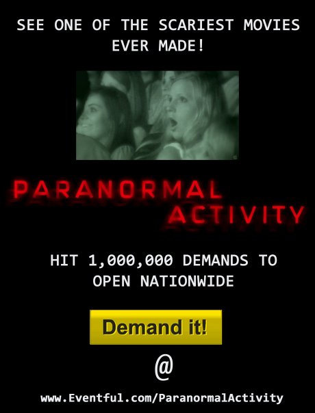