The NFL season thus far has been…interesting, to say the least. We all know that the lockout must end asap, but we can’t help but look on with incredulous curiosity (with a hint of morbid amusement) as the replacement refs continue to make a mockery of the game.
But enough of that.
The reason I bring up the ludicrosity of the past 3 weeks is because I happened upon these beautifully redesigned NFL logos by Matt McInerney. Even if you’re not a football fan, you can’t deny that these minimalist interpretations are clever, engaging, and oftentimes a lot more alluring than the current logos.
Cleveland Browns:
“Dog pound + football nose + helmet stripes”
Minnesota Vikings (alternate version):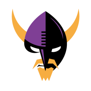
Tennessee Titans:
“The colors and three Xs maintain the reference to the colors and
three stars on Tennessee flag. The remainder forms a T in formation
against the defense, using Xs and Os, the classic chalkboard illustration
of offense and defense.”
Green Bay Packers:
“This interlocking G & B, set in chamfered type,
is a nod to one of the early Green Bay Packers logos.”
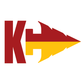
San Francisco 49ers:
“Pretty simple: Gold Miners Pickaxe + Football”
Houston Texans (alternate version):
“Instead of a referencing a long horn, this version uses an H + T to
create field goal posts, with a Lone Star shooting through the
uprights to cross the H.” 
NFC & AFC:
“These logos rethink the stars in the current A and N wordmarks as
compasses, to be used in calling out NFC/AFC North, East, South,
and West. The animation attached shows how the points of the star could
be used for this.”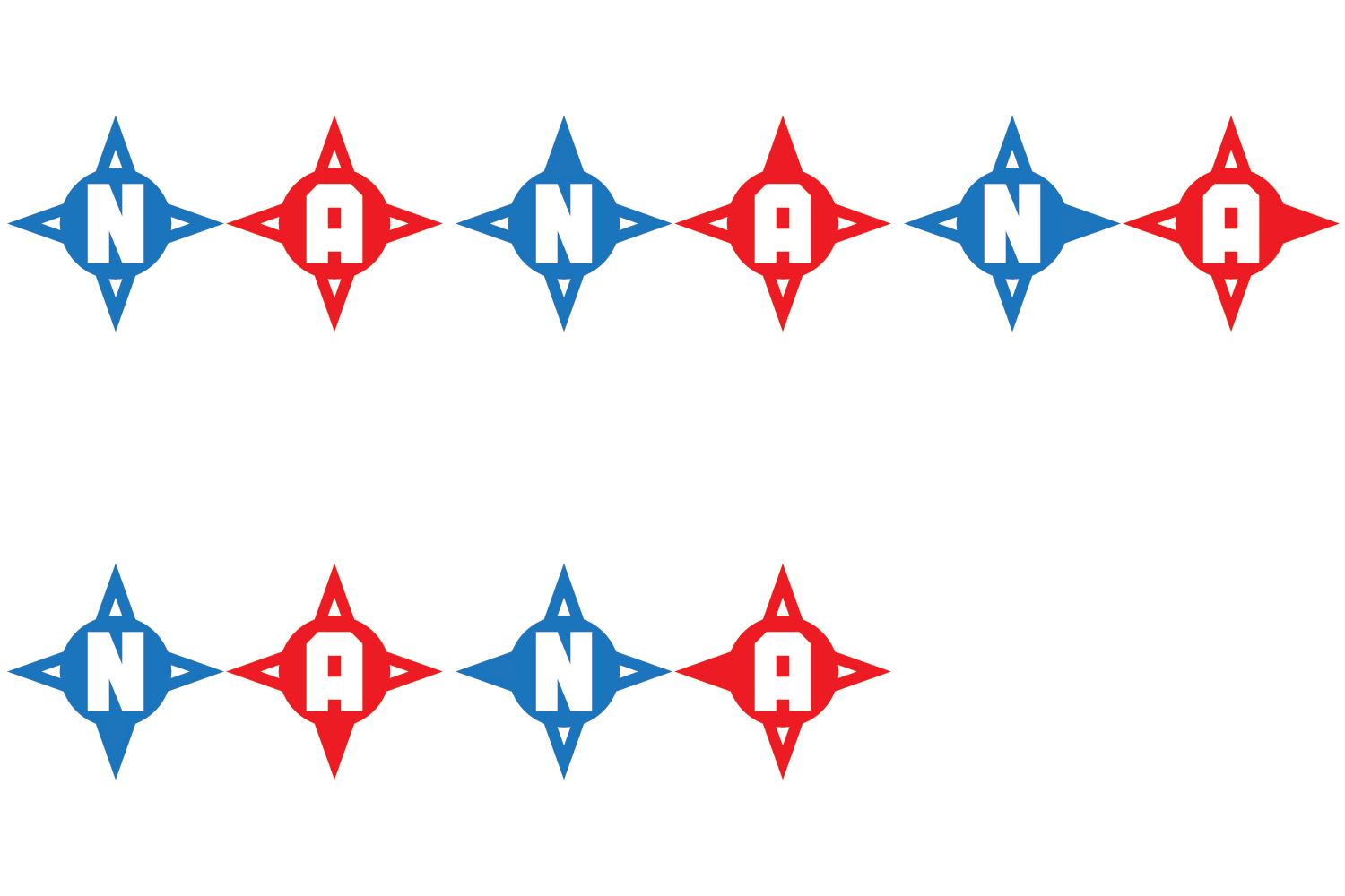
Philadelphia Eagles:
“E + Wing in team colors. Pretty simple. Cheers to a new season of football!”
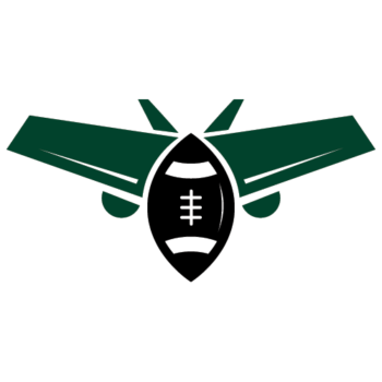
Seattle Seahawks:
“Hawk + Waves in team colors.”
St. Louis Rams:
“A merger of the great helmet design with the mascot logo,
with a design based on perfect circles.”
I’m especially diggin’ the Seahawks, 49ers, and Vikings logos. How about you?
McInerney states that new logos will be added periodically, so be sure to check back if your favorite team hasn’t been featured yet. (And yes, I already requested a Ravens logo!)
Via Logo Design Love.







 I like books, gadgets, spicy food, and art. I dislike shopping, hot weather, and the laws of entropy. Although I am a self-proclaimed computer nerd, I still have a love for handbags and makeup... and I am always teetering on high heels. To learn more about me, visit the

Some I love, some aren’t my taste, but above all: if it requires an explanation, it’s not quite there yet. A logo should be easily understood without someone telling you why it’s clever, at least that’s what I recall from my identity class in college. Most are awesome though! Especially love the raiders
I’m loving the 49ers and the bears! these are awesome!
I love these!
That Houston Texans logo is absolutely brilliant. Wish the 9ers logo was thought out as good.
All of these are great. The Seahawks design is even better than their already awesome logo. The Texans alternate and 49ers are simply brilliant. Fun Browns and neat work on the Dolphins. I’d love to see some NHL re-dos!
I’m not really a fan of minimalist design, but these are, for the most part, really nice. I especially like the Browns logo. Well done, but, I’d like to see one for my Buccaneers!
They are ALL cool! I like different concepts of NFL logos. BROWNS is definately my favorite!
Would love to see the Falcons,and Giants great job