The New York Times Magazine has posted beautiful photographs of the all the balls used in the World Cup, starting from 1930! And here I thought they were still using the black pentagons, white hexagons ball circa 1970. That just goes to show how much I know about soccer. ...
Continue readingWe all know that Apple is not a fan of Flash and is in full support of HTML5 replacing the ubiquitous multimedia platform. (Although I'm not a big fan of Flash myself, I don't get Apple's argument against Flash for not being "open" when their products are some of the most closed, proprietary out there. But that's just me.) Well, just what the heck is HTML5 and what's so great about it? Being a web developer, I feel like I have been reading and studying up on HTML5 for decades. And while I can take hours writing a post to try to explain it to you, I found something better: a kickass infographic. Via TheBlogIsMine. P.S. — Don't you just love infographics?...
Continue reading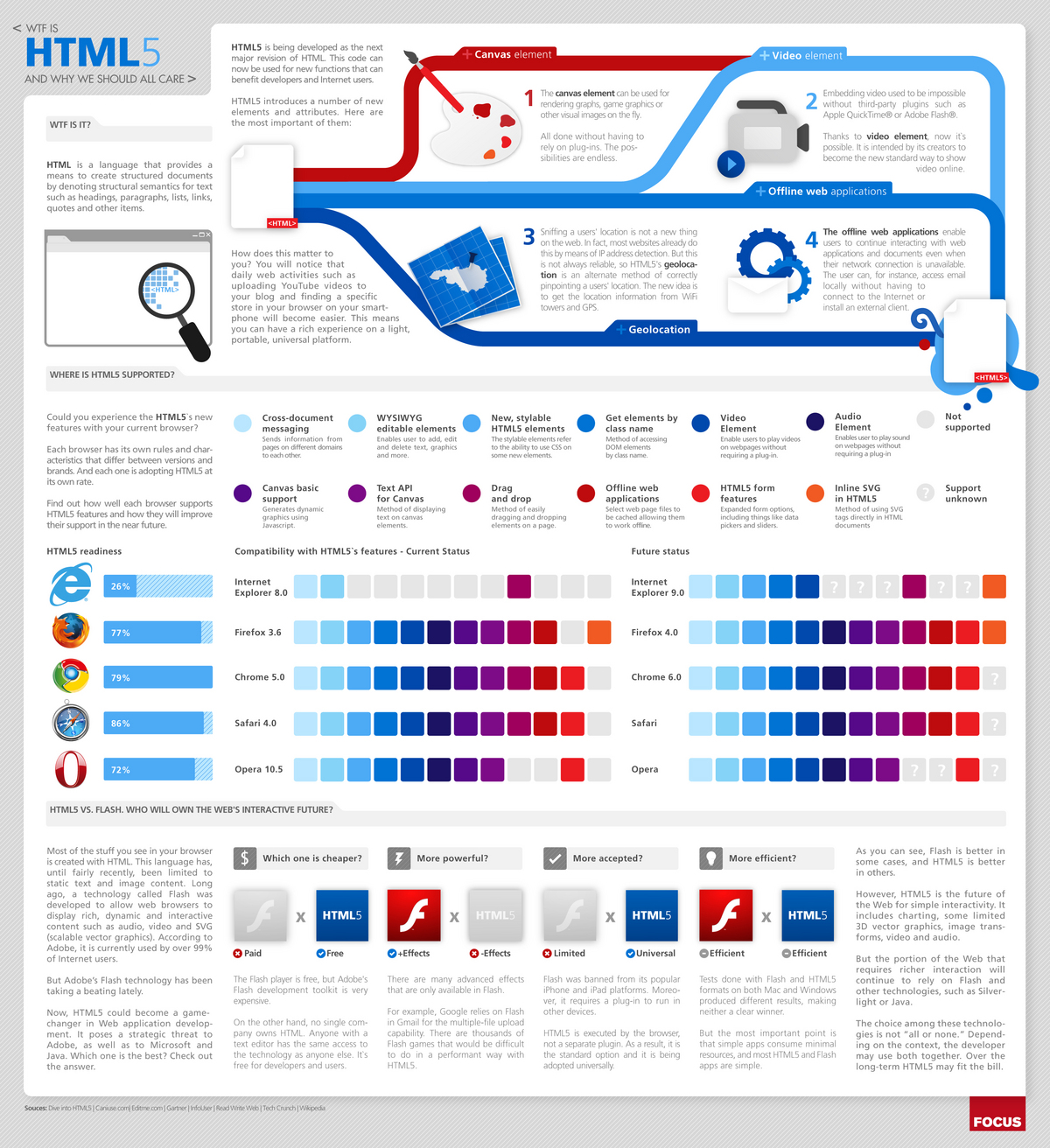
I have never been one to do "tourist-y" activities, even when I am at a locale I have been dying to visit. I'm pretty sure that my aversion to tourist-y activities comes from the combination of the fear of being mistaken for a stereotypical Japanese tourist (because apparently, all Asians look alike) and being around annoying tourists in NYC. Now, a map is available for people like me who prefer to stay in areas that are less likely to be congested with tourists: Created by neo-cartographer Eric Fischer, the Tourist vs Locals map is based on the frequency of photos taken over certain time periods. The blue areas represent photos taken by people who have taken pictures in the same city over a...
Continue reading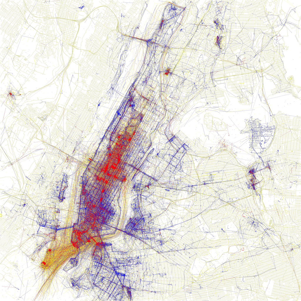
Last week I wrote a post titled The Importance of a Consistent Brand which focused on a popular Pepsi vs Coca-Cola chart that was being circulated on the web. Brand New today cleared some misconceptions about the Coca-Cola logo, and stated that the popular chart is, in fact, inaccurate. Looking at the updated chart, there have been some changes in the Coca-Cola logo...
Continue reading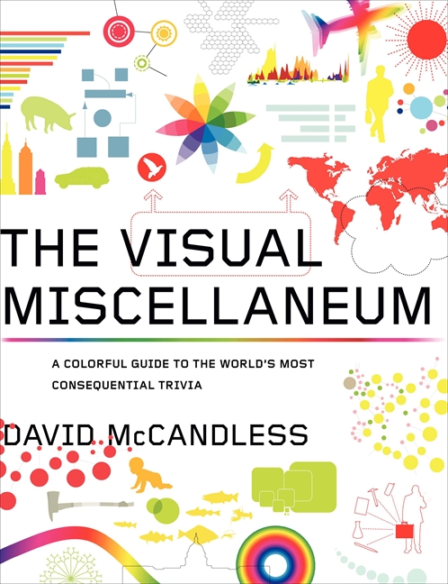
Gizmodo just featured an image from the upcoming book The Visual Miscellaneum: A Colorful Guide To The World’s Most Consequential Trivia. As a lover of design, data collection, charts, and graphs, data visualization is right up my alley. I was delighted to discover that there exists a corresponding blog called Information Is Beautiful. Unfortunately, the blog is still fairly new and so only houses 13 posts - not nearly enough to quench this geek's unsatisable thirst for knowledge. However, I have no doubt that the blog will blow up very soon...
Continue reading