I used to work in marketing, so seeing this kind of stuff fascinates me. In this video, Matt Rosenman rebrands the ubiquitous Snickers bar so that it may appeal to five different target audiences: fitness folks. crunchy crowd, diet-conscious, parents, and those seeking energy bars. It's honestly impressive how changing the wrapper can the entire personality of a chocolate bar. Nothing inside the bar has changed — no ingredients added or subtracted. But just by highlighting certain aspects of the bar, by using certain colors and fonts, he is able to make it almost seem like an entirely different item. (Companies get away with doing this all the time too, just look at all the "made for women"...
Continue reading
I haven’t featured anything logo-inspired in a while, so when I came across this in my Twitter feed, I knew I’d have to share it. 😉
Having worked with branding at a previous job, I can be a bit of a logo nerd; as such, I already knew most of these hidden messages nestled within the logos. But revisiting good design is always a great way to instill and inspire, not to mention the “zOmg that’s so coo!” factor behind some of these ideas!
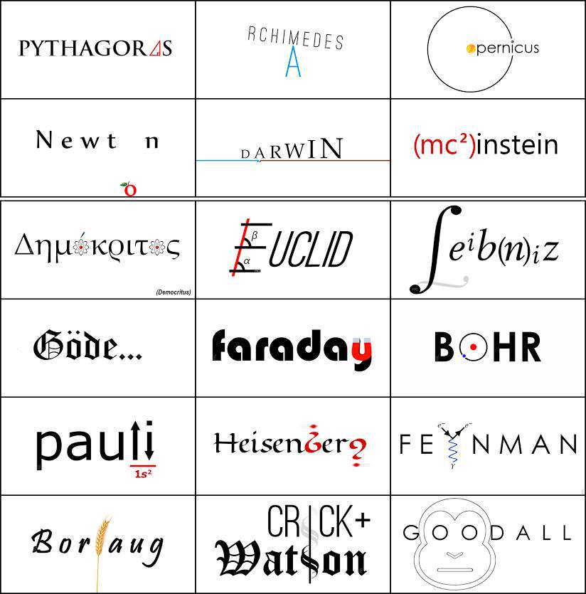
1. Sony VAIO
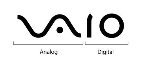
If you divide the word “VAIO” in half, you can see that the first two letters represent an analog symbol, while the last two are binary. Pretty neat, huh?
2. Baskin Robbins
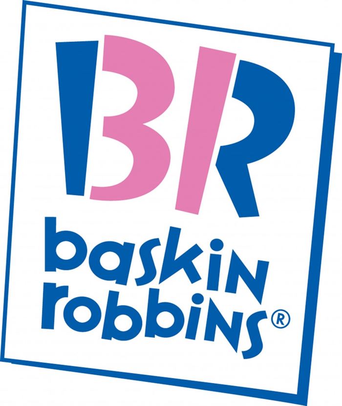
This one’s more common-knowledge than the rest. The part of the logo that is highlighted in pink is the number 31, which is the number of flavors the ice cream chain famously offers.
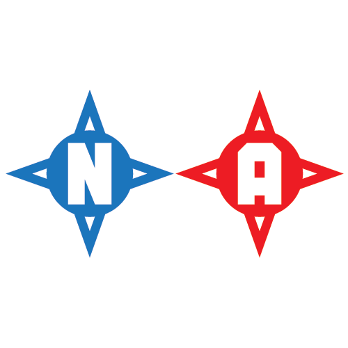
3. Northwest Airlines
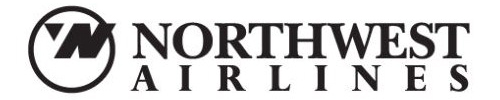
This logo has two hidden messages: the first is that you can see both an N and a W within the negative space. The second is harder to spot, but it’s pretty cool when you notice it — the triangle in the circle also serves as an arrow that points northwest.
What do you guys think of Yahoo!’s new logo?
![]()
Just in case you weren’t aware, this new logo was revealed after a 30 Days of Change campaign which announced the internet giant’s plans for a new logo and built anticipation by showcasing a different logo every day for — you guessed it — 30 days.
![]()
30 Days of Change expectedly received tons of press, and while the buzz died down after the first few days, it definitely got people to talk about Yahoo! again — an achievement in itself according to those who dismiss Yahoo! as a “dying” company.
The campaign also may have been designed as a preemptive warning to the millions of users who visit Yahoo! every day so that the new logo does not come as a complete shock.
But was the buildup — and the expectations that grew along with it — worth it?
Sorry, no Tesla. Designed by Kapil Bhagat, via Reddit....
Continue reading
The NFL season thus far has been…interesting, to say the least. We all know that the lockout must end asap, but we can’t help but look on with incredulous curiosity (with a hint of morbid amusement) as the replacement refs continue to make a mockery of the game.
But enough of that.
The reason I bring up the ludicrosity of the past 3 weeks is because I happened upon these beautifully redesigned NFL logos by Matt McInerney. Even if you’re not a football fan, you can’t deny that these minimalist interpretations are clever, engaging, and oftentimes a lot more alluring than the current logos.
Houston Texans: