Mar 12, 2011  •  In Books, Gadgets, Geek, Parenting, Personal

Matilda vs The E-Reader

One of the many things I am thankful to my parents is that they never discouraged my love for reading while growing up. We were very, very poor in my early years of life but they always put aside money for my books. My mother would make time to take me and my sister to the library every week despite her 70+ hour work schedule. And they never banned genres either; I read all the thrillers, mysteries, and even comic books I liked.

Sure, I was — and in many ways continue to be — a socially awkward girl who preferred to have her nose in a book than go out and interact with others. And while my overactive imagination has gotten me in plenty of trouble over the years, I wouldn’t trade the thousands of books I’ve read in my lifetime for any other life experience.

I want the same for my children. I always tell J that while I want our kids to be technophiles like their parents, I want their first material source of information+entertainment to be books. In other words, I want to make sure that I instill in them a love for books before the introduction of computers, televisions, video game systems, etc.

And as much as I know I may be fighting a losing battle here, I want them to always love and prefer physical and tangible BOOKS over e-readers. (I wrote back in 2008 that I would not dump books to go digital and my stance remains the same.)

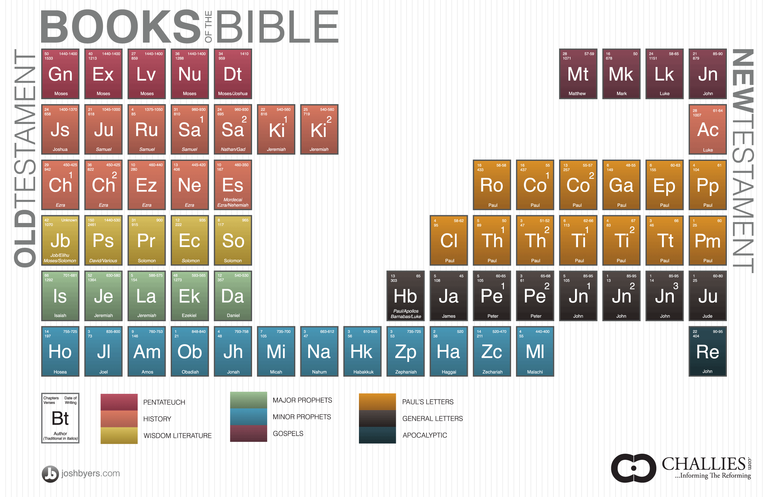
This is precisely the reason the following comic strip hit so close to home with me. Especially since Roald Dahl is one of my favorite authors (did you know he has written some fantastic adult novels too?) and “Matilda” is a classic loved by millions. As Flavorwire writes:

Cartoonist Aaron Renier, author of Spiral Bound and The Unsinkable Walker Bean, has created a wonderful homage to Roald Dahl’s Matilda, imagining her as she might exist in our current (and future) age of multi-media e-readers for kids. Matilda’s evil, plaid suit sporting father gives the literature-loving Matilda an “iSwindle” and chastises her for wanting to use anything as low-tech as her imagination.

Enjoy!

You may also like:

Mar 11, 2011  •  In Blogging, Geek, Personal, Tutorials, Web, WordPress

WordPress for the Everyday Blogger:
Part 5 – The Rest of the Header

Prelude
Part 1: Setting Up

Part 2: Set the Bare Bones
Part 3: The Header
Part 4: The Main Menu

In this post I will discuss how to complete the rest of the header elements in my blog theme.

First up: the searchbar.

In WordPress, adding a searchbar is relatively simple. All you need to do is insert the line <?php get_search_form(); ?> into wherever you want the searchbar to be.

So in this case, since I want the searchbar to be included in the header section, I opened up the header.php file and created a new div called “searchbar” like so:

<div id="searchbar">
<?php get_search_form(); ?>
</div>

I just added that to the very end of the header.php file, then saved. Here is what I ended up with:

Right. Not exactly how I want it.

The good news is that from here on, all I need to do is use some CSS to modify the position and size of the “searchbar” element:

#searchbar {
position: absolute;
margin: -15px 0 0 632px;
overflow: visible;
width: 230px;
z-index: 1;
}

Keep playing around with the position and size until you get your desired effect. At this point, you can leave the searchbar the way it is (without an actual “search” button), but if you’re anal and like to make things difficult (like me!), you may choose to add a button next to the search field. Here is the CSS I used (this replaces the searchform CSS in the original style.css file):

#searchform {
margin: 0;
padding: 14px 0 20px;
}

#searchform input#s {
margin: 0;
padding: 4px 8px;
width: 150px;
border: 1px solid #FFFFFF;
color: #828282;
-moz-border-radius: 6px;
-khtml-border-radius: 6px;
-webkit-border-radius: 6px;
border-radius: 6px;
}

#searchsubmit {
margin-top: -2px;
padding: 0;
width: 50px !important;
height: 24px;
background: url('/images/search_button.png');
border: none;
line-height: 1px;
font-size: 1px !important;
vertical-align: top;
cursor: pointer;
}

#searchform label {
display: none;
}

Lastly, you need to delete the searchform.php file within the theme’s file folder since this file is what makes the search button disappear in the ET-Starter theme. (The presence of this file dictates how a search should work, but WordPress search works just fine without it.)

Your theme should now look like this:

Now, onto the left portion of the header.

In order to do this, all I did was create another div called “headerleft” and added it to the end of my header.php file. I then filled in the content within the div and saved the header.php file. Here is exactly what I added to the end of header.php:

<div id="headerleft">

<a href="https://www.geekinheels.com/"><img src="/images/title.png" border=0 width="262" height="45"></a>

<div id="profileblurb">

I like books, gadgets, spicy food, and<br />
art. I dislike shopping, hot weather,<br />
and the laws of entropy. Although I<br />
am a self-proclaimed computer nerd,<br />
I still have a love for handbags and<br />
makeup... and I am always teetering<br />
on high heels. To learn more about<br />
me, visit the "About" page.

</div>

<div id="feedlinks">

<ul class="feed-list-inline">

<li><a href="http://feeds.feedburner.com/geekinheels/blog" class="feed-link">Blog RSS</a></li>

<li><a href="http://feeds.feedburner.com/geekinheels/comments" class="feed-link">Blog Comments RSS</a></li>

</ul>

</div>

</div>

As you can see in the HTML, I added a bunch of CSS IDs and classes. This will come in handy in the next step, because leaving the file as is will leave you with this mess:

So in order to play around with the positioning and formatting, you will need to return to your style.css file. Here is what I added:

#headerleft {
position: absolute;
overflow: visible;
top: 9px;
margin-left: -30px;
width: 220px;
}

#profileblurb {
position: absolute;
overflow: visible;
top: 84px;
margin-left: 40px;
width: 220px;
color: #FFFFFF;
font-family: Verdana, sans-serif;
font-size: 11px;
line-height: 1.72em;
text-align: right;
}

#feedlinks {
margin-left: 2px;
padding: 0;
position: absolute;
overflow: visible;
top: 256px;
line-height: 1.7em;
}

#feedlinks a:link, #feedlinks a:visited, #feedlinks a:active {
color: #66CC66;
text-decoration: underline;
}

#feedlinks a:hover {
color: #66FF66;
}

.feed-list-inline li {
margin: 0;
padding-left: 20px;
background: url('/images/feed-icon-16x16-orange.png') no-repeat center left;
list-style: none;
}

And that should do it! Your theme should now look like this:

Stay tuned for the next post in this series: the sidebar!

You may also like:

Mar 11, 2011  •  In Cute, Twitter, Web

How to Be Awesome on Twitter [Slideshow]

Ed. note: My heart goes out to everyone affected by the devastating earthquake in Japan. I hope that anyone reading this has all friends and family members safe and accounted for, and I will continue to keep the nation of Japan in my prayers.

I confess that I have not been as active on Twitter lately because goshdarnit, there’s only so much social media you can participate in without feeling overwhelmed.

With that being said, I still am dumbfounded when acquaintances do not know what Twitter is, or claim that they do not “get” it.

So for those people, I present an adorably informative slideshow I discovered today. Created by @princess_misia, it is designed to help those who feel overwhelmed and confused by the 140-character information network. Enjoy, and please feel free to pass it along!

Via Bit Rebels.

You may also like:

Mar 10, 2011  •  In Art/Design

Word Puzzle Universal Wrapping Paper

What a clever concept by Fabio Milito and Francesca Guidotti — the Word Puzzle Universal Wrapping Paper lets the gifter locate the holiday or occasion for the present, circle it, and voilà! You’ve got a wrapping paper you can use in practically all instances.

No word on whether this product will ever hit the shelves, but if it ever does, you can be sure that this geek will be sure to pick up a set.

Via Design Milk.

You may also like:

Mar 10, 2011  •  In Blogging, Geek, Personal, Tutorials, Web, WordPress

WordPress for the Everyday Blogger:
Part 4 – The Main Menu

Prelude
Part 1: Setting Up

Part 2: Set the Bare Bones
Part 3: The Header

It’s been over a month since the last post in this series, and for that I apologize. This is what we had when we left off:

First, let’s work on the main menu.

As you can see from my header image, I have incorporated the outline of the menu into the header image itself. You can choose to create a separate menu background image and lay it on top of the header image, but I find that option to add an extra step (at least with this design) so why bother?

Since the outline of the menu is already taken care of, all you need to do is to format the text, background, colors, etc of the menu items using CSS.

Once again, use Chrome’s “Inspect Element” feature (or if you’re using Firefox, use Firebug) to find out what the CSS elements are for each item you’d like to change. ET-Starter’s CSS for its menu is a bit convoluted, but once you examine it you will see that it is a series of nested lists. So while the menu in its entirety uses the #menu element, each menu item is #menu ul li a and each submenu item is #menu ul li ul a.

If you are not sure which element goes with what, just experiment, changing up different elements until you get your desired effect. And for your convenience, here is my theme’s menu CSS:

#menu {
margin-left: 270px;
padding-top: 21px;
font-family: 'Trebuchet MS', Trebuchet, Verdana, sans-serif;
font-size: 15px;
color: #FFFFFF;
}

#menu ul {
position: relative;
z-index: 300;
margin: 0;
padding: 0;
}

#menu ul li a {
margin: 0;
padding-right: 14px;
display: block;
border-bottom: none;
color: #FFFFFF;
}

#menu ul li a:hover {
color: #C0E0FF;
text-decoration: none;
}

#menu ul li {
float: left;
position: relative;
margin: 0 10px 0 0;
padding: 0 0 9px 0;
list-style-type: none;
}

#menu ul ul {
position: absolute;
display: none;
width: 8em;
margin: 9px 0 0 0;
padding: 10px;
background: #505050;
border: 1px solid #666666;
z-index: 99999;
}

#menu ul li ul {
display: none;
width: 10em;
padding: 0;
position: absolute;
z-index: 999;
line-height: 20px;
}

#menu ul li ul li { padding:0; }

#menu ul li ul a {
float: left;
width: 8em;
height: auto;
padding: 4px 10px;
color: #FFFFFF;
font-size: 12px;
}

#menu ul li ul a:hover {
height: auto;
border: none;
border-radius: none !important;
text-decoration: none;
color: #B3A6BB;
}

#menu ul ul ul {
top: auto;
padding: 0;
}

#menu ul li ul ul {
width: 10em;
left: 8em;
top: auto;
margin: 0 0 0 20px;
}

#menu ul li:hover ul ul,
#dropmenu li:hover ul ul ul,
#dropmenu li:hover ul ul ul ul {
display: none;
border: none;
}

#menu ul li:hover ul,
#dropmenu li li:hover ul,
#dropmenu li li li:hover ul,
#dropmenu li li li li:hover ul {
display: block;
}

#menu ul li.current_page_item a { color: #FFFFFF; }

#menu ul li.current_page_item li a { color: #FFFFFF; }

#menu ul li li a { color: #FFFFFF; }

#menu ul li li a:hover { color: #B3A6BB; }

#menu ul li.current_page_item li a:hover { color: #FFFFFF; }

#menu ul li ul li.current_page_item a { background: none !important; }

With the new styling in place, your menu should now look like this (what you won’t see in this screenshot are the hover effects):

But what about the menu items? How would you change those?

Right now the theme is set up so that whatever Pages you create, they will show up in the menu. If you want to exclude any Pages from the menu, you can use one of the many plugins that are available which allows you to do exactly that, or you can follow the instructions in the WordPress Codex.

That being said, I decided to go with a more labor-intensive method which allows me complete control over what is in the menu. This method is especially useful for instances where you would prefer a top-level menu item for not be to be linked to a Page but only open up a sub-menu, as is the case for the “Links” menu item.

In order to do this, I opened up my header.php file again. All the way down below, you will see a div container called “menu”:

<div id="menu">

<?php if ( function_exists('wp_nav_menu') ) { wp_nav_menu( array( 'container_class' => 'menu-header', 'theme_location' => 'primary-menu', 'depth' => '4', 'show_home' => 'true' ) ); }

else {?>

<ul>

<li class="<?php if (is_home()) { ?>current_page_item<?php } else { ?>page_item<?php } ?>"><a href="<?php bloginfo('url'); ?>" title="Home">Home</a></li>

<?php wp_list_pages('title_li=&sort_column=menu_order&depth=4'); ?>

</ul>

<?php } ?>

</div>

Since this code calls for all the Pages to be listed in the menu, you want to delete everything between <div id="menu"> and the very last </div> and replace it with an HTML list of your desired menu items. So in this case, the following is what I did:

<div id="menu">

<ul>

<li><a href="https://www.geekinheels.com/about">About</a></li>

<li><a href="https://www.geekinheels.com/archives">Archives</a></li>

<li><a style="cursor: pointer;">Links</a>

<ul>

<li><a href="https://www.geekinheels.com/friends">Friends</a></li>

<li><a href="https://www.geekinheels.com/bee-friends">Bee Friends</a></li>

<li><a href="https://www.geekinheels.com/favorite-sites">Favorite Sites</a></li>

</ul>

</li>

<li><a href="https://www.geekinheels.com/contact">Contact</a></li>

</ul>

</div>

Your menu should now look more like this (and when you hover over “Links” a sub-menu should slide out):

As always, if you have any questions, please don’t hesitate to let me know!

Up next: let’s finish the rest of the header section!

You may also like:

Mar 10, 2011  •  In Funny, Personal

“Boob” is the Perfect Word

Via The Daily What.

P.S. — Blogging continues to be light as I’m still feeling pretty crappy these days. I’ve been to the doc earlier this week and while the meds he’s given me seems to be helping a bit, I have yet to feel myself. I will write more about my physical condition in a later post, but for now all I can ask is that you keep me and my family in your prayers. Thanks.  🙂

You may also like:

Mar 7, 2011  •  In Baby, Claire, Motherhood, Personal

Growing Up

Teething update: last week I felt a tiny tooth poking out…but the next the day it was gone! What the?!? As usual, I turned to the interwebs to make sure I wasn’t going loco and it turns out that it’s perfectly normal for a tooth to reverse itself. Great.

The good news is that Claire no longer seems to be in pain from teething. So yay for that!


I occasionally wonder if I’ll ever look back to the first few months of Claire’s life and really miss it. Because right now, I don’t miss it. AT. ALL.

Now that Claire is nearing 6 months of age, she is starting to become quite fun. I now know exactly what to do to procure a smile and even elicit peals of laughter. She now has a favorite toy (Lamaze’s Jacques the Peacock), favorite activity (playing in her walker), and favorite thing to stare at (all the pictures, cards, and postcards on the fridge).

My little girl’s personality is starting to shine through too. She’s quite stubborn, just like her mommy (I’m pretty sure that she will roll back-to-front before front-to-back, or even crawl before rolling front-to-back, because whenever she’s on her tummy she makes NO effort to roll over no matter what I do), but is also a shy little girl, evidenced by her smiling and hiding her face whenever we face the mirror together.

Claire is also starting to understand cause and effect. She now knows that pressing certain buttons on her toys will create music and sound. And at no other time was this more apparent than this past weekend, when J sat her down in front of my digital piano…

Once daddy pumped up the volume and set the sound to “Organ” mode, she absolutely went wild and had a ball of a time banging on the keys.

See? She already looks like a virtuoso —

I know that some women absolutely adore the baby phase and wistfully look back to those days as their children grow older. Then there are those, like me, who look forward to the future knowing that their kids are maturing and learning with each passing day, and anticipate the day when they could start holding adult conversations with their children.

Maybe it’s a personality thing? Ever since I could remember I wanted to be older. Even now, at the age of 30, I want to be older still. I actually look forward to the days when I will be old and wrinkly. Anyone with me?

You may also like:

Mar 6, 2011  •  In Entertainment, Personal

Clarissa Goes from Explaining It All to “Clarissa Now”

Does anyone remember the early 90s Nickelodeon show Clarissa Explains It All? I used to watch it ALL the time, fully soaking in the witty narration of Melissa Joan Hart’s Clarissa Darling, enjoying her wacky outfits and accessories, and wishing that I too had a best guy friend named Sam who would climb in through my window.

I always thought that Clarissa and Sam should hook up, and was majorly disappointed when they tried to be more than friends in that one episode which turned out to be a big FAIL. I was also sad to see the sitcom come to an end after 5 seasons and wondered why Clarissa couldn’t go on explaining it all in college…

Well, apparently the show’s producers had wondered the same thing!

Late last year, the pilot for Clarissa Now, the coulda-been spinoff of Clarissa Explains It All was uploaded to YouTube and the interweb has finally taken notice. According to Flavorwire:

Though the intro music still has some na-na-nas, in Clarissa Now, Miss Darling is 18 and interning at a newspaper in New York City, winning over her bosses (including the publisher, played by Tony Lifetime Achievement Award recipient Marian Seldes), pissing off the suspiciously cute reporter-in-training, playing with laughably outdated office equipment and riding the subway, which looks exactly the same as it does today. Unfortunately for us, CBS passed on the show, so the series was never filmed, but Clarissa fans can still click through to watch the pilot and have their minds blown. As Sam would say, what’s the worst that could happen?

Ack!

And here it is, for your viewing pleasure:

I haven’t watched it yet, but I will as soon as I finish writing this post!

P.S. — Other live-action Nickelodeon shows I used to enjoy watching include Salute Your Shorts, Are You Afraid of the Dark?, and The Secret World of Alex Mack. And after watching a few episodes iCarly and Wizards of Waverly Place, I feel like the pre-teen shows these days just don’t compare. Or maybe my tastes are just old-fashioned?

You may also like:

Mar 5, 2011  •  In Art/Design, Baby, Books, Claire, Geek, Parenting, Personal

Goodnight Dune

I try to read to Claire every day but I must admit that I still feel a bit silly reading to an infant whose neverending drool threatens to soak the book with each turn of the page. And frankly, I find most books that are designed to be read to babies are…well, boring.

Oh how I cannot wait until I can start reading to her the Harry Potter and LOTR books, or even my favorite Shel Silverstein poems, and have her understand them! I am even eagerly awaiting the days when she will beg “One more chapter please?” as the clock creeps outrageously past her bedtime.

But I digress.

Margaret Wise Brown’s classic Goodnight Moon is one of the books I bought for Claire when I was still pregnant, determined to turn my future offspring into a bookworm just like her mom. I had actually never read the book myself, but I thought that it must be something amazing since every nursery seems to have a copy.

But when I read it for the first time, I couldn’t help but wonder why it is so popular. In fact, I believe the exact thought that came to mind was, “What is this crap?”

(I apologize to anyone who loves the book. I understand that it’s supposed to be a child‘s bedtime story, and as such, adults like myself may find it dull and uninteresting. Even Claire doesn’t seem to care for it much. Perhaps she will as she gets older?)

I couldn’t help but wonder if I would be more interested in the book if it contained subject matter that is more to my taste…

And today I was granted an answer.

Introducing Goodnight Dune, a mashup of Goodnight Moon and the David Lynch movie version of Dune:

Click on through for the rest.

And you know what? I find the new version much more interesting, and even fun.

I doubt that an actual book will be published due to copyright restrictions, but one can certainly dream, no?

Via Flavorwire.

You may also like:

Mar 4, 2011  •  In Apple, Baby, Claire, Funny, Gadgets, Geek, Parenting, Toys

Conan’s Honest iPad 2 Promotional Video

As I’m sure the majority of my readers are already aware, last week the iPad 2 was announced with a flourish only reserved for Apple’s cult products.

Despite the not-too-impressive advances from the original iPad (to me, thinning the profile and slapping two mediocre cameras to the device do not warrant a significant upgrade), thousands of iPad owners are already ditching the old iPads for the newer models.

Apparently, I wasn’t the only one underwhelmed by the upgrade. Conan O’Brien aired a mock promo of the iPad 2 on his show last night, alongside the headline “iPad 2. You’ll buy it no matter what we say.” Take a look at the clip below — I couldn’t help but let out a chuckle at the smooth talker with “a non-specific ethnic accent.”

That being said, there’s a very good chance that we will be adding an iPad 2 to our household. Although I have no need for the device, J could use having a portable computer that is (1)not falling apart and (2)not his work laptop.

He is sure that Claire will get a kick out of it too, as she already stares with fascination at his touchscreen phone. I have heard that there are many baby-friendly apps available for the iPad which we will be tempted to download for our progeny. However, I am hesitant to let a (drooling, clumsy) baby play with such an expensive device.

How about you? Do you have an iPad, and if so, are you planning to upgrade?

Would you let your baby play with an iPad?

You may also like: