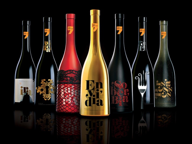
Designed by Sidecar Publicidad of Spain, these wine bottles which each represent one of the seven deadly sins are...
Continue reading
Designed by Sidecar Publicidad of Spain, these wine bottles which each represent one of the seven deadly sins are...
Continue readingRemember the Cars to Autobots infographic which left me wondering when the Decepticon version will be released? Well, the wait is over, as the good people at http://www.carinsurance.org have followed up swiftly: It is regrettable that not all of the art was available as is stated at the bottom of the chart. It also sucks that Megatron is not depicted because he does not transform into a vehicle. (But he deserves a special place on the infographic as leader of the Decepticons, no?) Via Geektyrant....
Continue reading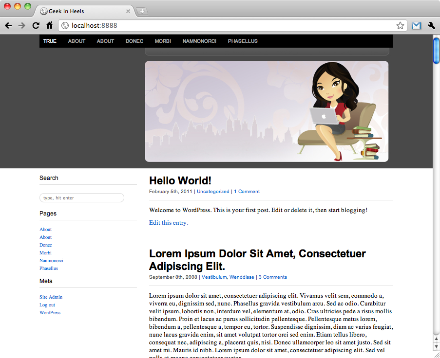
Prelude Part 1: Setting Up Part 2: Set the Bare Bones Another great thing about the ET-Starter theme is that it allows you to easily set your header and background — whether it be an image, a color, or both. Just navigate to the "Appearance" menu on the left side of your WordPress admin page, and you can choose "Background" or "Header" and make the changes accordingly. If you are happy with just uploading a header, you can stop right here. If you want to know how I managed my header, read on...
Continue reading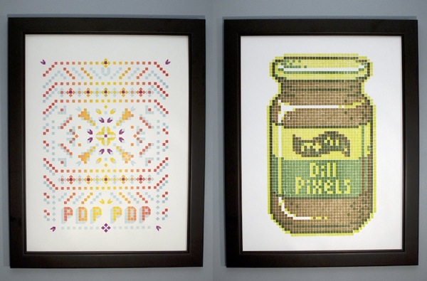
Because regular letterpress isn't enough for us geeks! Get your own Lego letterpress prints at Physical Fiction. Via Flavorwire....
Continue reading
I must have looked especially haggard yesterday morning, because as soon as J woke up he announced, "I'll take over. Go sleep. NOW." (I love this man.) Knowing that the baby was in good hands with her doting father, I gathered the dog into my arms and snuggled up in bed. I took a wonderful 2-hour nap, and when I emerged from our bedroom refreshed and energized and ready to relieve J from baby duty, he assured me that everything was under control and that I should go "do my own thing." (Have I mentioned that I love him?) And so I did. Grocery shopping. Watching a couple of episodes of Veronica Mars on Netflix. Surfing the web. By the time the baby's bedtime rolled...
Continue reading