
I have never been a fan of the coffee conglomerate known as Starbucks. Sure I love me my coffee. However, the super chain has always seemed so contrived with their run-of-the-mill bland food items, ambience that screams “yuppy hipster here!”, and overpriced coffee.
I much rather prefer the taste of the sub-$1 Dunkin’ Donuts coffee anyway.
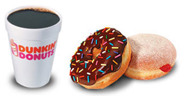
I like my coffee plain, with a side of donuts.
And what’s with the size names?
“I’d like a medium coffee please.”
“You mean a grande drip.”
“Yes, you pretentious ass.”
This is precisely the reason I was so delighted to see the new packaging designs for the market Brooklyn Fare. No-nonsense packages with simple, whimsical, and effective messages.
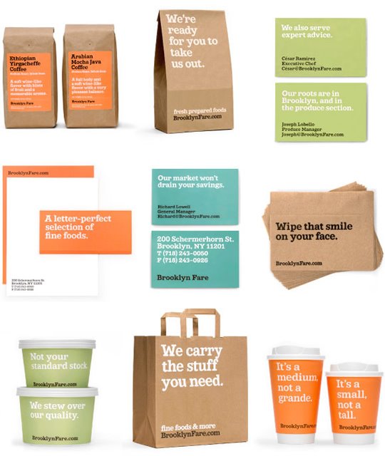
Did you notice the coffee cups on the lower right? Here’s a closer look:
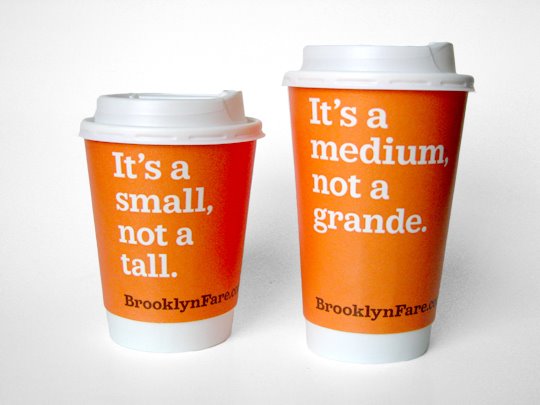
LURVES IT! Thanks to Packagings of the World for putting a smile on my face this dreary Monday morning!
Suffice it to say, you will never catch me placing a 34-word order at Starbucks (ie, Double Ristretto Venti Half-Soy Nonfat Decaf Organic Chocolate Brownie Iced Vanilla Double-Shot Gingerbread Frappuccino Extra Hot With Foam Whipped Cream Upside Down Double Blended, One Sweet’N Low and One Nutrasweet, and Ice.)
Incidentally, this order has been credited as single-handedly destroying the economy of South America.

 I like books, gadgets, spicy food, and art. I dislike shopping, hot weather, and the laws of entropy. Although I am a self-proclaimed computer nerd, I still have a love for handbags and makeup... and I am always teetering on high heels. To learn more about me, visit the
love it!
That’s superb. I have never been able to fathom the whole "small = tall" nonsense. It’s SHORT. I mean, I get that it’s an attempt to mess with our minds, convince us that we’re getting something big when we’re not. I’m just flabbergasted that ANYONE would ever fall for it, or that Sbucks would believe that we would.
Plus, I just like this company’s design. Nicely done.