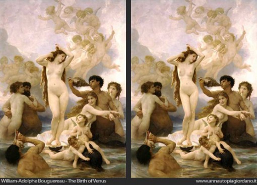
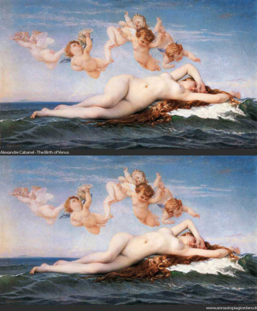
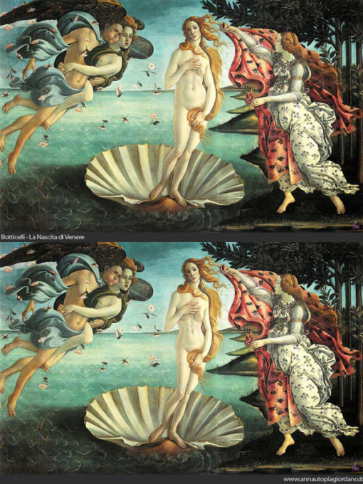
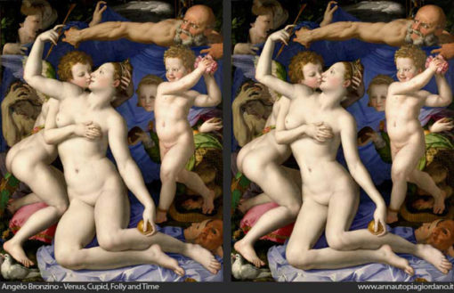
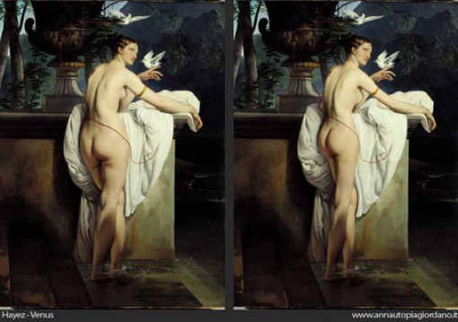
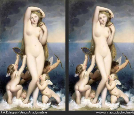
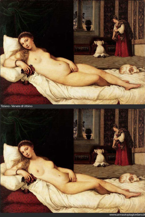
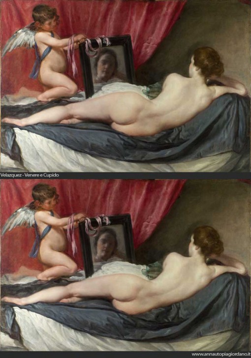
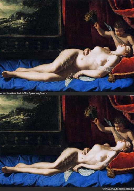
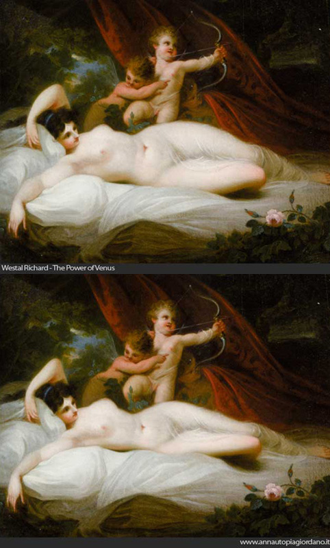
In her Venus project, Italian artist Anna Utopia Giordano asks the question “What would have happened if the aesthetic standard of our society had belonged to the collective unconscious of the great artists of the past?”, digitally altering great classic works of art to better fit today’s waif-like standards.
I will be completely honest; some of the subjects of the paintings do look better after their waists have been tucked in and their breasts made fuller, like Richard Westall’s The Power of Venus. However, others — like Boticelli’s The Birth of Venus — just look plain wrong.
What are your thoughts on Ms. Giordano’s work?
Via Flavorwire.





 I like books, gadgets, spicy food, and art. I dislike shopping, hot weather, and the laws of entropy. Although I am a self-proclaimed computer nerd, I still have a love for handbags and makeup... and I am always teetering on high heels. To learn more about me, visit the


I think Ms. Giordano is being generous. The models I’ve seen look much less nourished than the images she presents.
Agreed with Eek- the post-photoshop paintings look thinner, but still healthy. Models these days do *not* look healthy at all!
As a trained art historian and having seen many of these paintings in person, I found that all the paintings look wrong to me since they are out of proportion. They just don’t fit in the painting.
@Devon, that’s an interesting comment. 🙂 Just out of curiosity, how are the bodies out of proportion? Would love to hear from someone who actually understands art, being an artistic newbie myself.
I think this is really really terrible. Yes, the photoshopped paintings have thinner looking models, but to me they just look younger. Women who have lived 35 or 40 years, who have had babies and have used their bodies to nourish babies and lived a life that is not squarely centered in the gym…they have pouchier stomachs, larger thighs and hips, and less perky boobs. THAT DOESN’T MEAN THEY ARE LESS HEALTHY! That just means they are women, not girls.
This whole post kind of skeezes me out, the female form is beautiful, but the idea that they look “better” when they more closely resemble teenage girls who have slimmer hips, flatter stomachs, and perkier boobs is…well…it’s a really slippery slope to NastyVille.
I think you’ve missed the point that the artist is trying to make. She is not saying that the altered versions are any better or healthier; she is merely pointing out how the standards of beauty have changed over time.
As for my preference of the “after” version of the Westall piece? That’s just one example from my own personal preferences. When I look through all of these, there are some which I believe look more attractive in their original form, as well as some I believe look more attractive after the photoshopped treatment.
What a seriously fascinating study!
In all of these pictures, the photoshopped versions feel like they’re missing their soul to me.
The women in the originals present power and feminine sensuality, they’re possessed of the moment and totally comfortable in their own skin. The curviness, the breadth of hip and thigh, the sheer volume of the women’s figure on the canvas speaks to this overwhelming and breathtaking beauty of the art and the female. They convey exactly what the artist wanted to convey.
The thinner forms, while beautiful, are just pretty. They don’t have that je ne sais quoi that makes me know this is a woman who inspires a painter to paint. Their flatter stomachs look apologetically sucked in, insecure, unsure of if they belong – they remind me of unripened fruit, virginal yet meek.
Ahem, anyway. Quite an interesting thought experiment.
Great comment, PartlyPixie – I don’t think I could add anything else to it!
I can barely tell them apart. Some of them look like they’ve slightly smaller bellies and bigger boobs, but it’s hard to tell.
I am a Life Drawing Artist and have been drawing models for the past 14 years…the models are real people and not shop front mannequins, they come in all shapes, ages, sexes and sizes.
The original works shown here look to me, more realistic. The latter versions are either unrealistic or perhaps better described as, unnecessary. I would leave them as they are.