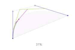
I have no idea if the designer(s) of Apple’s famed logo had this in mind when at the drawing board, but considering Apple’s attention to detail, I wouldn’t be surprised if this was meticulously planned out. 🙂

Via I Love Charts.

I have no idea if the designer(s) of Apple’s famed logo had this in mind when at the drawing board, but considering Apple’s attention to detail, I wouldn’t be surprised if this was meticulously planned out. 🙂
Via I Love Charts.


 I like books, gadgets, spicy food, and art. I dislike shopping, hot weather, and the laws of entropy. Although I am a self-proclaimed computer nerd, I still have a love for handbags and makeup... and I am always teetering on high heels. To learn more about me, visit the "About" page.
These represent the current most popular posts (by pageview). If you would like to see a more comprehensive list, please see my Popular Posts page.
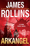 Arkangel James Rollins |
 Revenge of the Tipping Point Malcolm Gladwell |
 The White Lotus |
|
Very cool – I’m sure they designed it that way! 🙂